Debunking stereotypes about the identity of UI and UX design
Updated 27 Oct 2022
10 Min
5578 Views
The word "design" is something that is now on everyone's lips. Everybody knows how important it is for developing a high-quality application. However, it is often taken as a generalized concept. When hiring a designer, a business owner may not completely understand exactly what kind of specialist is needed. A common mistake is to think that the people responsible for all visual parts of the application could be such a triple threat. In fact, this just isn't so. Just like in any other profession, a specific role of design has a defined set of responsibilities.
For instance, a graphic designer specializes in creating eye-catching icons and other visual elements, a motion designer is in charge of animation that appears here and there in an app, the UX designer takes care of the app usability, whereas a UI designer makes sure that the application is properly laid out.
In this article, we will focus on the last two lines and analyze the main differences between UI and UX design, as well as the possibility of combining them into responsibilities for a single person.
What is UX?
Before diving into the details, it is necessary to make it clear about what the above terms stand for. We'll start with UX, which is short for the user experience. If you ask me how I would describe the UX designer's responsibilities in simple words, I would say that he / she is accountable for how the product feels. In other words, UX is about the convenience of usage, logic in the actions flow, and the relevance of control buttons. It really doesn't deal with the visual presentation of the product, but rather makes sure that all the visible elements are arranged for maximum comfort for a client.
The term was originally coined by Don Norman, a director of Design Lab at the University of California. According to his words:
Don Norman
Director of Design Lab
Human interface and usability were too narrow. I wanted to cover all aspects of the person's experience with the system including industrial design, graphics, the interface, the physical interaction, and the manual.
Expanding his idea, it is fair to say that the user experience is associated not only with sensations while interacting with an application or software, but the impressions that remain after using the product. To support this statement I'd like to fall back on the words of Matt Powers, a Graphic Designer and Internet Marketer at Blue Soda Promo.
Matt Powers
Graphic Designer and Internet Marketer
UX designers are concerned with how the user experiences the product. They want the user to come away from the app feeling good.
It's also pertinent to cite a passage from Danielle Sacks, a senior writer at Fast Company Magazine.
Danielle Sacks
Senior writer
Design is about 3 dimensions and the 5 senses.
Visuals can tune your senses up
What is UI?
Now it's time to talk about the visible side of the design which concerns user interface. While UX is in charge of the favorable location of buttons, UI makes sure that these buttons look pleasing to the eye, an interesting animation appears as you press them, and the background color doesn't conflict with the colors of the other elements. UI designers have a big responsibility delegated on their shoulders as he / she takes care of the initial impression that a client receives when your app first launches. As you know, there won't ever be another chance to improve it.
A good UI design is the one which keeps pace with the content of your product and complements it's main idea. According to Jeffrey Zeldman, the onstage lecturing on modern web design at An Event Apart:
Jeffrey Zeldman
Designer
Content precedes design. Design in the absence of content is not design, it's decoration.
It is widely accepted that a quality mobile UI design is characterized by it's simplicity and minimalism. This does not mean that it must be poor or look dim. Nevertheless, saturating elements or using a gob of colors is now out of fashion.
Funny enough, those opinions appeared long ago when people knew nothing about smartphones and mobile applications. According to Antoine de Saint-Exupry, a world-known French writer and journalist:
Antoine de Saint-Exupry
French writer and journalist
A designer knows he has achieved perfection not when there is nothing left to add, but when there is nothing left to take away.
Modern technologies still follow that tendency. Here is how John D. Berry, an editor and typographer, confirms it:
John D. Berry
ditor and typographer
Only when the design fails does it draw attention to itself; when it succeeds, it's invisible.

All kinds of apps need great UX
What is the difference between UI and UX?
As you can see, UX and UI are pretty different concepts. Moreover, in the big projects, these are also different positions occupied by separate specialists. Basically, this is due to the fact that the range of responsibilities of the UX designer greatly varies from the set of responsibilities of the UI expert and requires a certain type of thinking for effective implementation.
It might sound strange but, to some extent, UX requires more creativity than UI. They're in charge of creating an app concept from scratch. In it's turn, the UI designer only has to work out the visible part of the application on the basis of a ready-made wireframe.
In order to create an effective experience, UX designers should study and analyze the behavior of potential users. In the meantime, a UI designer usually works according to the requirements provided by a customer.
UX designers are mainly responsible for scenarios and tasks flows, and UI designers - for colors and typography. UX touches on human-centered design, UI - with visual design. UX lies at the root of doing research, outlining wireframes, and making prototypes. UI stands for creating layouts, composing graphics, and building mockups.
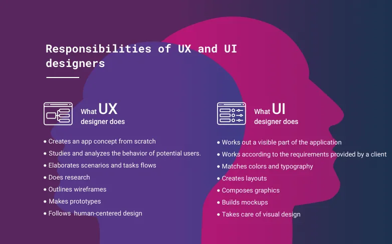
Core responsibilities of UX and UI designers
How UX and UI fit together
Even though UX and UI are rather different they can hardly exist separately. In particular, concerning UI which becomes totally useless when isolated from the product scope.
If we talk about a mobile application or website, good user experience doesn't separate from interface design. Today users are spoiled enough not to be surprised by the sole presence of interesting options. They also expect to receive aesthetic enjoyment from interacting with your product. Continuing this idea I'd like to quote Helga Moreno, a copywriter at Template Monster:
Helga Moreno
Copywriter
Something that looks great but is difficult to use is exemplary of great UI and poor UX. While Something very usable that looks terrible is exemplary of great UX and poor UI.
It is totally supported by Joshua Brewer, a mentor at Designer Fund, who says that:
Joshua Brewer
Mentor
Just because something looks good doesn't mean it's useful. And just because something is useful does not make it beautiful.
So, in order to create a useful and beautiful thing, you equally need both UX and UI design experts. Based on the reason that their responsibilities are so closely linked to each other, they are often performed by a single person. Most often this approach is applied to non-current projects which deal with a moderate amount of work.
Tips for creating effective UI and UX design
Let's find out how to achieve top results when designing for mobile apps, websites, or software products. Based on Cleveroad's experience, we have obtained the following principles:
Do not rely solely on UI guidelines
Flat and Material Designs build towers of strength for designers. Things tend to run a lot smoother when you follow their recommendations too. However, you should not take them as the only possible solution. The blind imitation of their techniques may lead to your product vanishing into the crowd.
Avoid broad selection
"The Paradox of Choice: Why More Is Less" by Barry Schwartz describes a contradictory, at first glance, situation when customers are more likely to make a purchase and are satisfied more often with it, based on the fact that they have fewer options to choose from. It is a fair assumption to say that this is also true for design. When you flood your application with options, you are likely to frustrate customers, rather than make them happy.
Pay attention to details
"The details are not the details. They make the design," said Charles Eames, a famous American architect. It is very important to be very careful with pop-ups, footnotes, labels, and other barely noticeable items. Working against fierce competition, you cannot afford to lose customers due to small annoyances.
It's time to unlock some sectrets about how to create design that will be warmly welcomed by the users! 6 Quick UX Design Techniques That Really Work
Forget about lorem ipsum
Using the technique above, you put graphics above the content which is not correct. The users mainly need your product because of the information and functionality it contains. Therefore, you need to make sure that the content is not an invisible component but rather a successfully positioned main element.
Leave a reasonable portion of free space
Almost a hundred years ago Jan Tschichold, German writer and book designer, said something that is still relevant today: "White space is to be regarded as an active element, not a passive background." This is a great approach which encourages a designer to handle one more powerful component instead of taking it as an unnecessary expense that has to be filled in.
Do not put unicity before all else
Opening yourself up in order to make a totally unparalleled, in terms of design, product makes no sense. Adapting conventional design patterns often brings an equal level of users satisfaction and greatly saves your time.
Be reasonable in responding to users' feedback
You cannot make everyone happy, so bad reviews are guaranteed, no matter how badly you polish all the gaps and flaws in your app. Judge them wisely. Single instances cannot be the reason for altering a whole app concept. However, if you receive a bunch of similar complaints, consider applying reasonable changes.
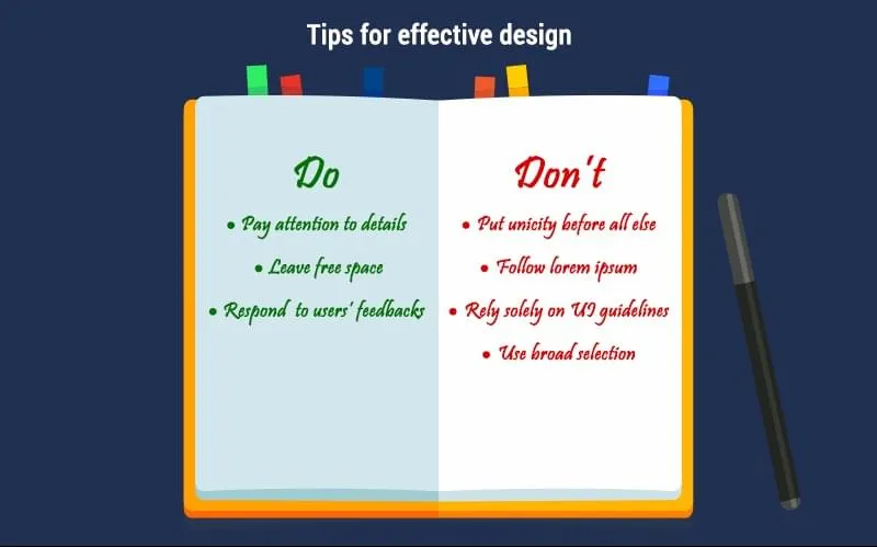
Tips for effective design
Hiring a designer
I hope this article has lifted the veil on design traits. Now that you're armed with this information, you can tackle the matter of employing a designer more accurately. Contact an outsourcing company, ask how the workflow is usually organized, how many people can be employed for this purpose, and how responsibility is distributed. Don't be afraid to ask for examples of previous work and try to look at it from a user's point of view.
I'm sure there is at least one more thing you are interested in: How much does it cost to design an app?
When deciding on a particular provider, don't drop all of the decisions on their laps. Be actively involved in the process of the design creation. Do not be afraid to talk about various ideas, even if they seem out of place to you. At the same time, reserve the right to make a the final decision for the professionals.
For inspiration, check out our projects on Dribbble. If you wants us to put your idea into action, feel free to get in touch with us any time of day or night.

Evgeniy Altynpara is a CTO and member of the Forbes Councils’ community of tech professionals. He is an expert in software development and technological entrepreneurship and has 10+years of experience in digital transformation consulting in Healthcare, FinTech, Supply Chain and Logistics
Give us your impressions about this article
Give us your impressions about this article

