7 Unexpected Logo Design Trends for 2025 to Follow & Couple of Things to Avoid
Updated 22 Dec 2022
10 Min
2764 Views
Logo is something more than a vector image, it's a benchmark that helps customers build the identity of a business in their minds. It becomes harder to compete with other companies, so entrepreneurs should pay great attention to how their businesses look like in order to stand out and increase brand awareness. Logotypes play a crucial role in all this and it's important to be aware of modern logo design trends to build the business identity in a right way.
This article will be useful for logo designers as well as business owners who want to understand how to create a modern-looking logo and find some business logo ideas.
Things to consider before creating trendy logo design
Many entrepreneurs wonder what goes first: design for logo or company's website? Though there is no the only one right answer to this question, we believe that business strategy goes first. When you have the well-defined strategy, you can make informed decisions concerning further branding steps. As a result, you get a more holistic picture of what you need from logo and website.
After you've gained a certain understanding, it's better to consult with your designers or find IT company providing design services in case you don't have any qualified in-house staff. They'll help you to solve this dilemma of choice making no mistakes.
Before we move to logo design trends, there are several more things that require your consideration:
Purpose
Every entrepreneur should be able to explain the logic behind his/her company's logo. What's more, any customer should be able to do so without deep thinking. Great business logos are a visual representation of the entire brand. Respectively, if customers can't describe the company's logo and it's logic effortlessly -- it doesn't create the brand awareness.
Alternative use cases
Remember that your logo should look well not only on the internet but in the real world as well. Think of future perspectives and imagine you decided to craft a branded t-shirt, notebook or rent a gigantic billboard to advertise the company. Does your logo look good enough in that case? Also, it's a good idea to check how recognizable your logo is if it's deprived of colors. Let's say it was colored in a black, white or gray palette. Logos are often printed black-and-white on official papers and such a simple test can help you to see how good it looks in that case.
Competitors
Before generating any company logo ideas, it's very important to analyze your company's major competitors. Figure out up to 10 of them and compare their visual design and logo. This way, you will see their strengths and weaknesses and be ready to work on them during the creation of your own logo. In addition, such a research gives you an opportunity to think critically, gain a fresh vision of the brand identity and use all this to create a recognizable logo.
Trends in logo design for 2025
It's always good to be up-to-date especially in a context of ever-growing competition and demand. However, you should remember that logo should stick to several core principles:
- Embody a brand;
- Be memorable;
- Be adjustable.
Logo design trends should serve to complement these principles, not vice versa. Let's consider current trends in logo design that will prevail in 2022.
1. Playing with typography
It's not a secret that logotypes are often accompanied by a text. Quite often, a text is the logo itself (e.g. The New York Times). However, you can't just take a default font like Arial, write the company's name using it and get an instantly memorable logo.
If the text serves as an addition to visual mark it should at least fit well to the rest of logo. But if the text is the only logo element -- it's typography should be aligned to the branding strategy. Today, in 2022, typography in web design is among the latest UI trends. Underneath you can see a couple of popular techniques in typography:
Negative space
This technique is used to form an interesting shape which is often associated with a company's activity. At the same time, the readability of the text remains unchangeable. Yes, this definition may seem to be a little blurry so let's consider the FedEx company logo example. The company utilized this technique in 90s. If you look closer at 'E' and 'x' letters, you will see they form an arrow which clearly associated with the logistics industry the company is engaged in.
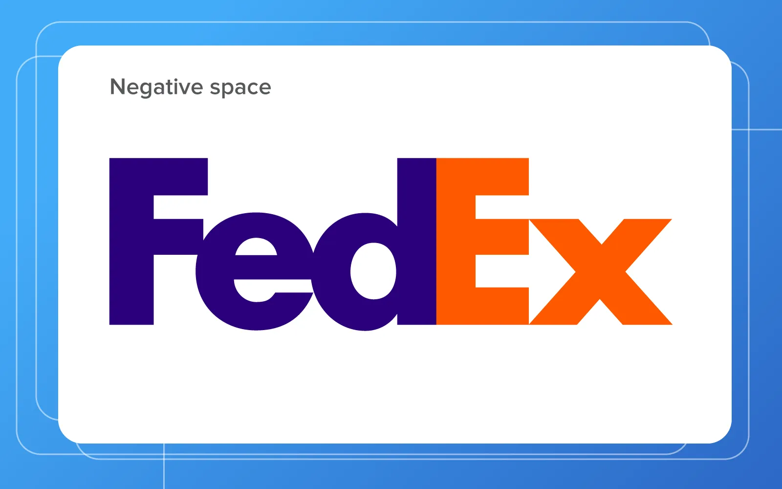
Company logo design examples: Typography
Hand-lettering
Another logo design trend related to typography is hand-effect text. It looks like it was written by hand. There are dozens of ways how hand-lettered logos may look like -- irregular, cursive, playful etc. However, it's rather an old-school technique that becomes popular nowadays than vice versa.
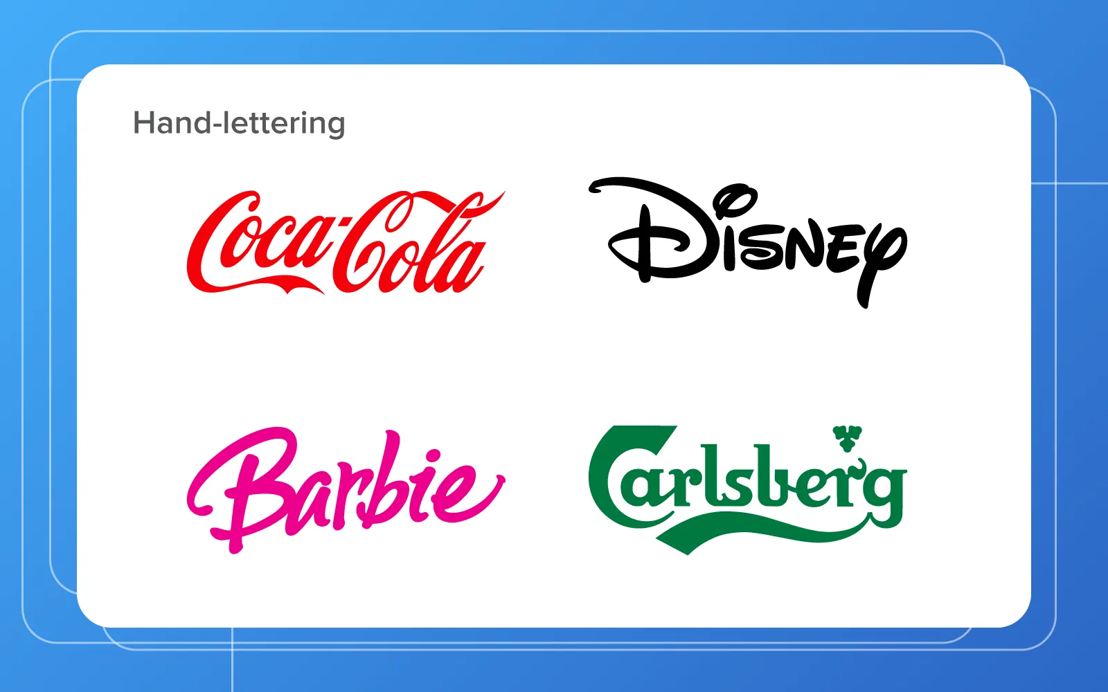
Company logo design examples: Famous companies using hand-lettering in logos
If you decided to stop on typographic logo -- try several variants before making your choice.
2. Using bright colors
Devices that surround us give an opportunity to enjoy not only visual designs but color schemes as well. Companies create the bright identity (if their sphere of activity permits this) and attract more attention this way. Logo design trends also shift to using bright colors. What's more, brands use different colors to influence their customers.
So, try to experiment with colors matching the identity of your brand and ensure that the final logo looks good on printed pages. This will help you to define the level of it's ease and printing expenses.
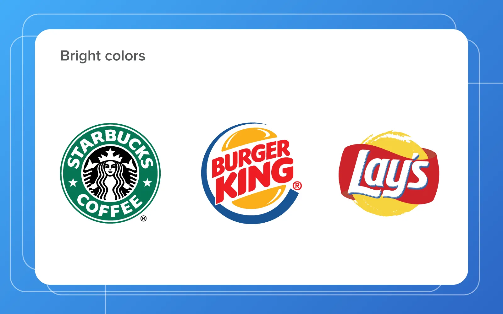
Company logo design examples: Companies using bright colors for logo design
3. Applying basic geometry
Geometric shapes are popular in a variety of art fields. Moreover, they confidently join the logo design trends for 2022. Such logos are neat, simple, and elegant. What else is needed?
Despite all it's advantages, geometric design isn't the universal solution. Geometric shapes don't always reflect the essence of the brand. So, this trend can violate one of the core principles -- logo should embody the brand.
On the other hand, if this logo design trend suits well to the brand it's a great opportunity to visually stand out among other companies in your industry, as well as increase brand awareness.
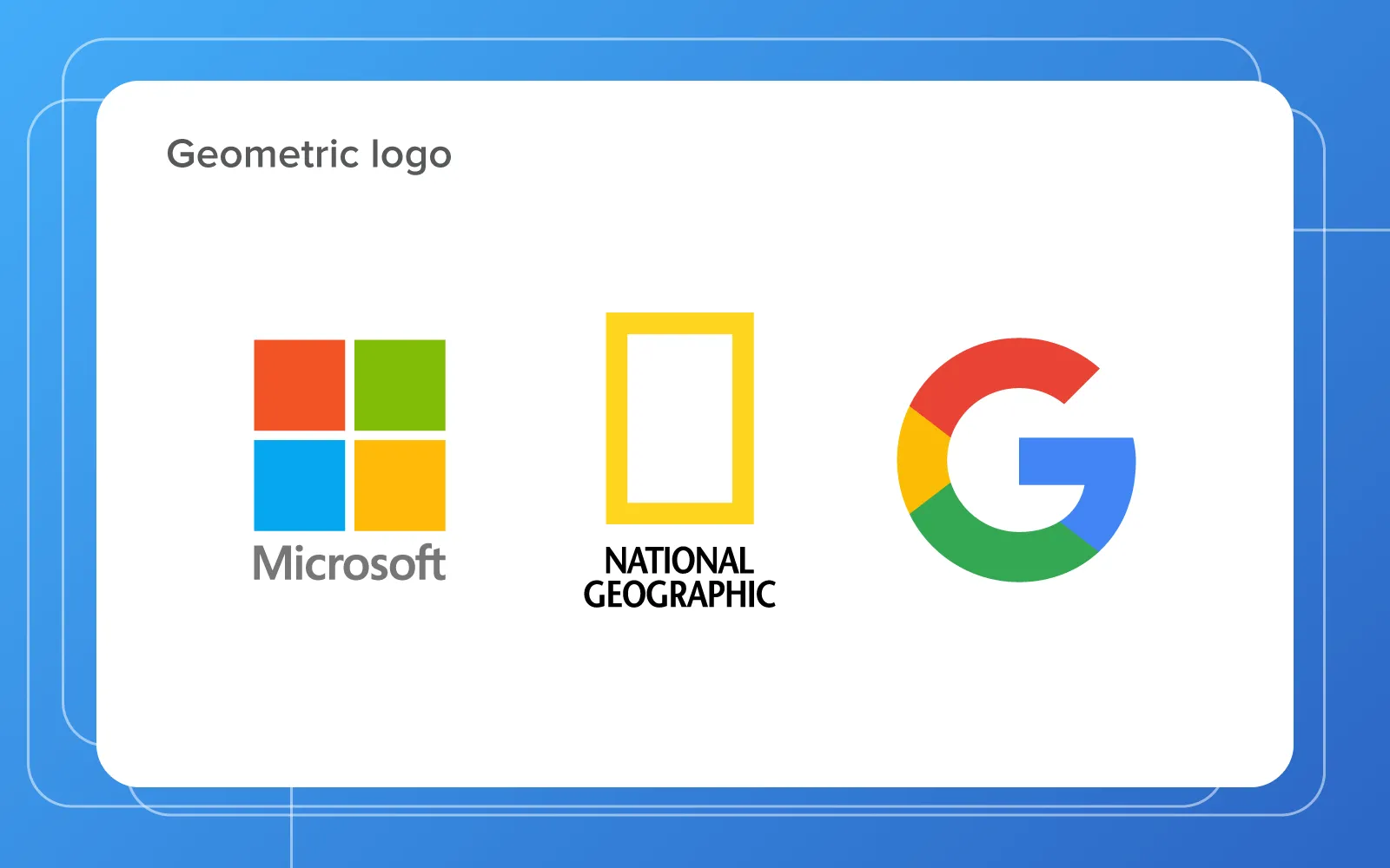
Company logo design examples: Companies using geometric shapes in logo design
4. Optimizing logos for social media
Social networks provide great marketing opportunities for companies and they can't be neglected. In other words, you should make sure your logo is media-friendly as it's one more trend in logo design for 2022. Let's figure out what this means.
As you know, most social networks offer users/companies to place a profile picture. A media-friendly logo should fit pretty well into the allocated space without being cropped and zoomed.
At the early stage of design, you should ensure that logo isn't too long in height or width. If it's not, there are no risks of cropping or zooming which can make it hard for your followers to see the content of the profile picture at a glance. The next step is actually to see how the final variant looks like as a profile picture.
This is a must for logo design. The principle of keeping a balance between resolutions, help to make sure your logo isn't too complicated. We mean, if it's too long or high it probably contains a lot of details or spare space. Both these factors may complicate it's perception by customers.
5. Mastering monogram & single-letter
Classics live forever and single letter logotypes along with monograms (combination of two or more letters) belong to it. In 2022, these logo design trends will only strengthen their positions.
Many entrepreneurs like the idea of taking one or several letters from the company's name to compose a logo based on them. Such solution looks good anywhere so UI/UX designers can effortlessly adopt it for the company's website, mobile app, advertising banners etc.
Read the full article about elements of a website that help build credibility with customers or watch our short video on this topic
8 UX Elements to Create Trust to Your Website
However, there is another side of the coin. This logo design trend may have no sense for your company if customers don't associate those letters with your brand. So, it's rather a good solution for those brands which already have a certain authority on the market. Besides, keep in mind that monograms or single-letter logos don't really tell much about the brand.
Company logo design examples: Companies using monogram in logo design
6. Presenting logos to a real world
Business owners should consider a new business logo design in different contexts. Websites and social media platforms are only the tip of the iceberg. As said, think of the company's future perspectives and needs. Business cards, packaging, advertisements are only a few of possible applications for your logo.
Hower, it depends on your design team as well. Good designers do their best to provide a customer with the complete picture of how the logo design will look like beyond the screens. For this purpose they generally use different mockups: signs, letterheads etc.
7. Creating fun & positive vibes
Funny logos are memorable and bright. So if the nature of your brand encourages bright colors or the use of characters at it's core, this logo design trend is your choice. What's more, such design decision can inspire your customers and help them to counteract negativity.
Logo design trends to avoid
Along with a bunch of positive trends, there are a couple of cliches we believe you should avoid at all cost.
Geometric people
It's obvious that most companies interact with people in one or another form. Nevertheless, people became a pretty common theme for logo design which is bad and here is why:
First
It's hard to underline the company's identity by using logos picturing people. Practically every business -- be it B2B or B2C model -- deals with people.
Second
It's virtually impossible to create a unique logo with people at it's core. There are too many of similar designs. So, each idea related to picturing people on the company's logo that you or your design team have generated already exists somewhere.
Your mission is to get a unique and recognizable logo. Geometric people won't provide you with any of these criteria.
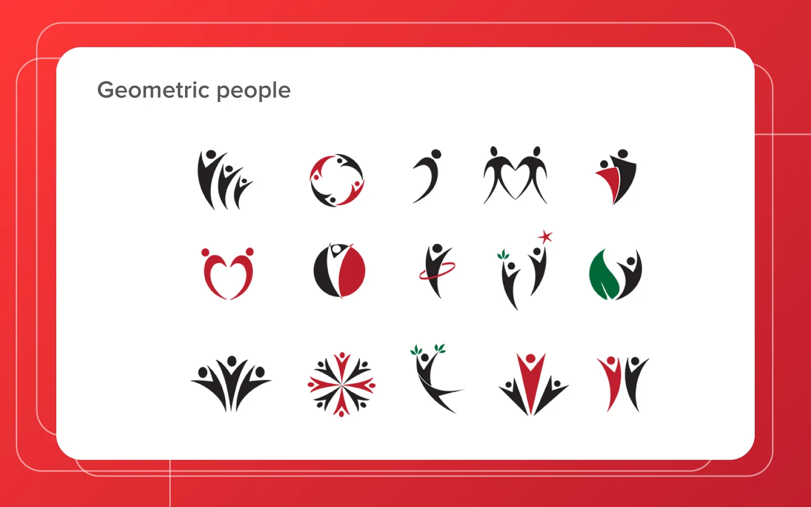
Logo design trends to avoid: Logos with people
Pixelated logos
The creation of a pixelated logo causing nostalgic feelings may seem to be a good idea at the first sight, but it's not. It affects the perception of the brand. Even if some customers regard it funny because it resembles of good old 80's, this perception may change to a negative one through some time. And your customers won't percept the brand as modern and serious one because you use a technique they regard as fun and old.
A pixelated logo example
The key point to remember is that you should tailor trends to your brand identity, not vice versa. The same thing with designs for a website, mobile app etc. Identity is the foundation for all these.
If you strive to build a strong brand identity through design and look for an experienced team -- we can help you. Talk with our managers and they'll answer your questions and consult you.
Like this article? Subscribe to our newsletter to get more insights from our team to your inbox. We send one letter a week with the latest videos and blog posts tailored to your interests.

Evgeniy Altynpara is a CTO and member of the Forbes Councils’ community of tech professionals. He is an expert in software development and technological entrepreneurship and has 10+years of experience in digital transformation consulting in Healthcare, FinTech, Supply Chain and Logistics
Give us your impressions about this article
Give us your impressions about this article