How to Develop for TvOS: First Face-to-Face Experience
Updated 26 Aug 2023
7 Min
5310 Views
The first serious project of developing for a brand-new Apple's operating system tvOS. Lots of difficulties were overcome during the development process. Here is what we have learned and can't wait to share.
Soon after a new Apple TV was announced and advertised I got an offer to take up the project, which involved development for the wonder of the fourth generation tvOS. The existing similar iOS app is quite simple. It looks like a web page with some additional functionality. Timid hopes to follow the same way, I mean to insert WebView and enter the website address, didn't leave me. Therefore, I immediately agreed to take over this project.
Where to start?
Naturally, I started with the installation of the new Xcode 7.1 with the support of tvOS SDK and upgrade to El Capitan beta. After only 15 minutes, I regretted about it. There was, unfortunately, no possibility to repeat the success of the previous application by inserting WebView. The matter is Apple has banned it's use in tvOS, as well as many other elements essential for me to create a new application.
Apple TV Human Interface Guidelines
The only things I used TV for were the Xbox and PlayStation, so I had a very superficial idea of how Apple sees the design of the applications. However, I had an overall understanding of the pros and cons of interfaces and their usability when there is no sensor, keyboard or mouse. To get a more detailed idea of how to move the Web version of the application on the Apple TV, I had to read the entire design documentation. The Guidelines, incidentally, were much better than Guidelines for iPhone/iPad. They more descriptive for beginners, with real examples and great designers' work.
By the way, in general, the Guidelines reminded me the combination of Xbox One interface with their tiles and upper Tab Bar and PlayStation's XMB. For those who wants to see a quick guide for all basic controls, Apple has posted an already made project.
'Trial and error' method
As I have iOS development experience, I was planning to start writing almost immediately. But, alas, it was not so simple. Apple has decided that many things in the running iOS are simply needless in tvOS. Even having read the article on developer.apple.com you will not face a ban on the use of a particular component until you dare to use it. The pre-release version of the documentation is sure to blame.
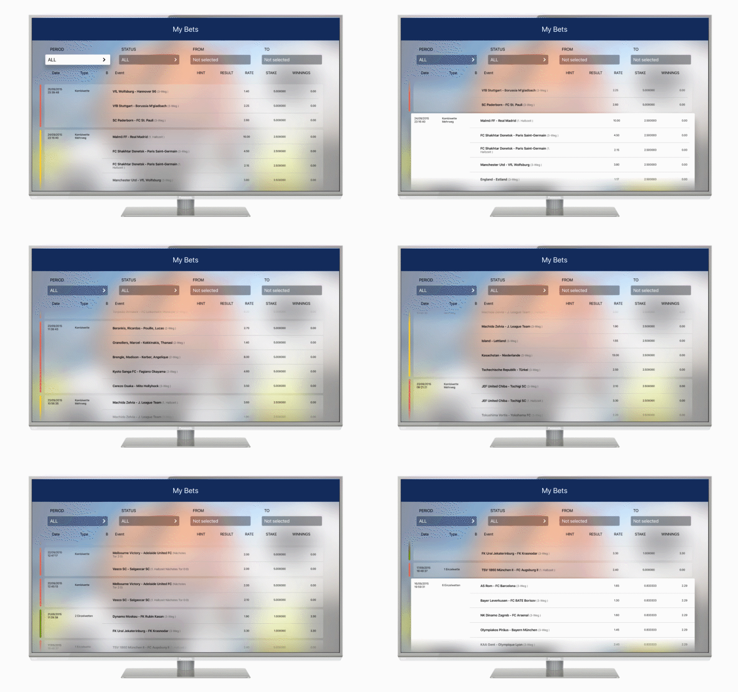
To gain some idea about the application, I will tell about it briefly. The app consists of:
- the registration screen which has a lot of text boxes
- the user agreement (stored on the server in the PDF file)
- login screen in the form of two text boxes
- the main screen with the output data downloaded from the server.
tvOS: A new look at navigation
Since this is not an iPhone and there is no possibility to tap on the screen in the right place, Apple has greatly remade navigation through the active elements, as well as on the screens themselves. As for me, it turned out to be quite adequate.
TabBarController is a nice change it is called automatically (selectable in focus) by pressing the Menu button on the Remote Control, or swipe up, if there is nothing else in focus. If you swipe over already active elements of the Tab Bar, the selected controller will be immediately displayed. Swipe down or tap will move the focus on prefferedFocusView.
Focus
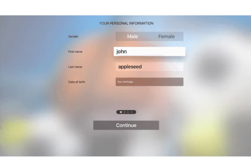
Focus is the way to select a needed object on the screen using the Remote (Siri) Control. The focus gets the item that you can be used, whether it is uitextfield, uibutton or tableviewcell. Transitions are performed by swipe gestures. The standard elements have basic animation, which indicates what item is in focus. The advantage of the focus at the moment is that it determines what items you can automatically switch to. They are the elements that lie on the same line vertical and horizontal.
The rest will have to be made by ourselves and UIFocusGuide was created for it. UIFocusGuide, in fact, is an invisible element that catches your gestures, and eventually, you can redirect the focus to another element. I used this when I began to implement the DatePicker, which Apple has cut, as well as all the standard pickers.
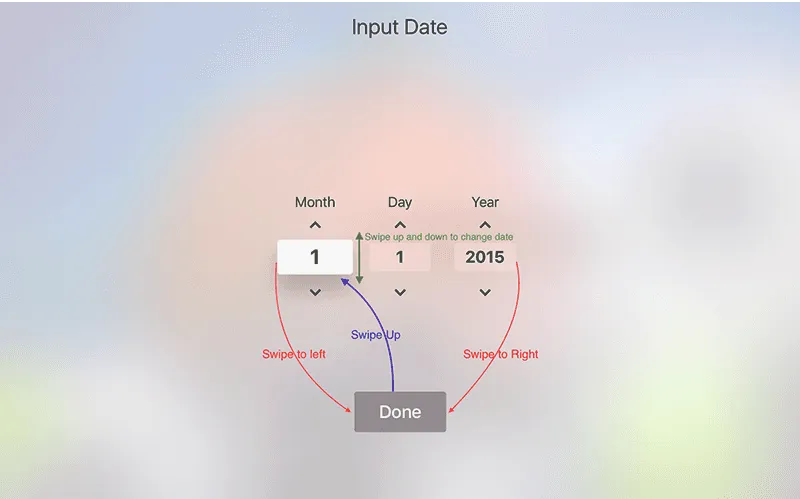
Take a look at the code.
//UIFocusEnvironment delegate Method
-(BOOL)shouldUpdateFocusInContext:(UIFocusUpdateContext *)context
{
          //go from done button to month field
    if ([context.previouslyFocusedView isEqual:[self doneButton]])
    {
        self.doneButtonSelected = NO;
        [self setNeedsFocusUpdate];
        return NO;
    }
          //Changing values of date components when user swipe up/down and max left and max right
    if ([context.nextFocusedView isKindOfClass:[UIButton class]])
    {
        [self updateDateComponent:context.previouslyFocusedView.tag WithHeading:context.focusHeading];
        return NO;
    }
//Swipes  month <=> day <=> year
    return YES;
}

-(void)updateDateComponent:(DateComponent)dateComponent WithHeading:(UIFocusHeading)heading
{
    switch (dateComponent)
    {
        case DateComponentMonth:
            //Move to done button
            if (heading == UIFocusHeadingLeft)
            {
                _doneButtonSelected = YES;
                [self setNeedsFocusUpdate];
                return;
            }
            //Swipe UP
            if (heading == UIFocusHeadingUp && self.dateComponents.month <12)
            {
                self.dateComponents.month++;
                _monthTF.text = [@(_dateComponents.month) stringValue];
            }
            //Swipe Down
            if (heading == UIFocusHeadingDown && self.dateComponents.month >1)
            {
                self.dateComponents.month--;
                _monthTF.text = [@(_dateComponents.month) stringValue];
            }
            if([self checkIfDaysMoreThanDaysInMonth])
            {
                _dateComponents.day = 1;
                _dayTF.text   = [@(_dateComponents.day) stringValue];
            }

   }
}
tvOS disadvantages
When developing a new application for tvOS I ran into some of the things that took me by surprise.
The absence of standard solutions
UIControl doesn't work as in iOS without a 'voodoo dance' so there is no other way than to listen to the advice given by Stack Overflow, or to create a UIButton by hands and add the necessary subviews.
If you create the UIButton, then forget about the normal palette for a button. You won't guess anyway, as a button uses blurred background underneath.
There are a few ways out:
- Installation backgroundImage as a color. 100% profit. Category UIImageWithColor is there to help you.
- Set background color will make just a "backlight". For the button, you will have to use .layer.cornerRadius, as the part of the background (color of your choice) will be seen under the button. 70% profit.
- Select the type of button custom. You configure it as in iOS, UIMotionEffect separately add to the button to have the same animation when it's in focus. ~0% profit.
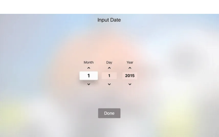
- The lack of pickers. DatePicker is not needed, PopoverController is not needed. Therefore, you'll need to implement your own control. The choosing of the date I have shown in the section Focus. Here is the replacement of popover or picker:

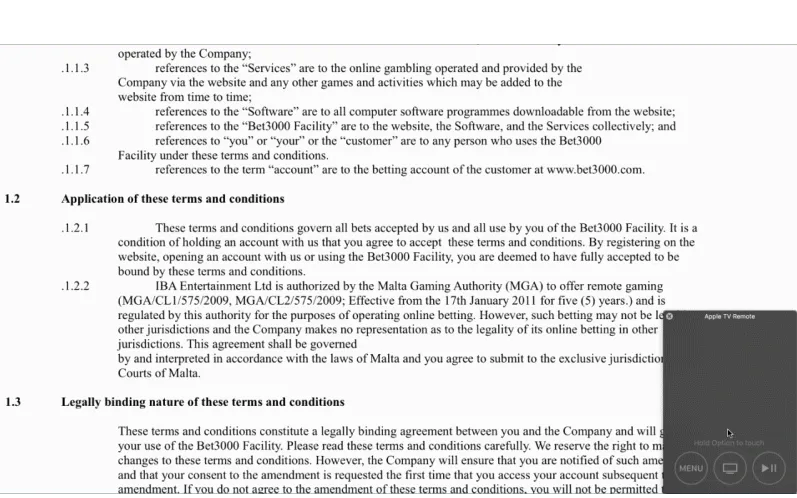
- UIDocument? Also, it is not necessary. Perhaps documents reading is not really needed on TV, but in my case, it was necessary for the implementation of the user agreement.
If you need a PDF Reader, use QuartzCore (ready-made example is on the Apple's site: PDFScrollView) with a few changes made:
- Since the project was for iOS, the scroll does not work here. Add to the class PDFScrollView:self.panGestureRecognizer.allowedTouchTypes = @[ @(UITouchTypeIndirect) ];
- In the class Tiled PDFView, we make changes so that the page loaded in only one zoom, otherwise each time you scroll, you will receive a blank page filling by squares.tiledLayer.levelsOfDetail = 1; tiledLayer.levelsOfDetailBias = 0; tiledLayer.tileSize = sizeOfDocumentPage;
Here are the drawbacks I have faced during my work:
Problem: UIControl doesn't work as before
IDE drawbacks
The most important disadvantage of IDE when developing an application is a requirement to do VC on a 100% scale. When developing the interface for iPad / iPhone, it was quite easy. You can make a freeform for the desired screen, make it's resolution more comfortable and fitting in a storyboard-screen, but in the case of precise layout requiring 100% markup, alas, this cannot happen. Or get a 5k monitor.
Plus, there is no CocoaPods support. So there will be an error at pod install. Let's wait for an update.
Results of work
The project was done in a short time, and most of the time it took to read docs. If you ask if I would like to do a project on tvOS? I think no, for now. We need to wait for updates, bring the system to mind, the complete writing the documentation, rather than blindly copy old documents, replacing iOS with tvOS.

Evgeniy Altynpara is a CTO and member of the Forbes Councils’ community of tech professionals. He is an expert in software development and technological entrepreneurship and has 10+years of experience in digital transformation consulting in Healthcare, FinTech, Supply Chain and Logistics
Give us your impressions about this article
Give us your impressions about this article
Comments
1 commentsnice article, good way to guide