How to Increase Conversion Rate With an App Redesign
Updated 15 Dec 2022
9 Min
4340 Views
'Pure, intense emotions. It's not about design. It's about feelings.' - Alber Elbaz, Israeli fashion designer. The issue of redesign concerns not just fashion but the feelings users have when they open your application. Especially after they have used other modern cool apps with intuitive UI and appealing design. So, if you have an app developed more than a year ago, stay with us to find out how to redesign an app, and how it will improve your product, increase app conversion rate and help you build strong customers community.
How redesign increases mobile app conversion rate
Redesign of an existing app is an essential step for each product owner. Let us walk you through the benefits you'll get if you decide to take this step.
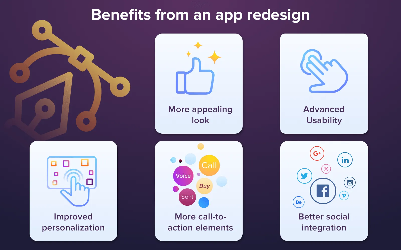
App redesign to increase your app conversion
More appealing look
Fashion is changing every day. The colours which we liked two years ago now look too alarming or vice versa boring. If your app targets mostly young people, the up-to-date design is very important to them. New users prefer a modern look and would choose an app which looks prettier. That is why you need to follow the latest design trends when you redesign your app. Remember, the young audience always requires very intuitive, simple and modern UI.
Advanced usability
Following the latest UI design trends, you will not only make the appearance of your app more attractive but also improve it's usability. How? Very easy. If you read our article about the latest UI design trends, you saw the modern design tends that make everything even more useful. Modern design uses automatization principle, so that a user doesn't have to input all the data manually. For that, your app needs to use as many sensors as possible.
Improved personalization
Almost all sorts of applications now can use AI technology to collect information about users, learn their preferences and needs and offer a customer just that information, he or she would most likely appreciate. Moreover, some modern apps allow users to choose the theme, create stickers, add or delete tools from a toolbar. All these features create a personalized UI of an app.
More call-to-action elements
An application redesign is a nice way to add as many call-to-action elements as you want. However, the modern approaches allow us to make these buttons intrusive and very appealing, which leads us to an ideal outcome - we persuade a user to do what we want and boosts app sales.
Better social integration
Social integration allows users to share the content from your app, or content they created with the help of your app, with their friends. It is a great way to acquire new users with minimal efforts. If your app already has integration with one or two social media, you can add more. And don't forget about messengers. Modern customers like to share content via WhatsApp or Telegram, so add them too.
When you are creating an app, you may not know your future users very well. It happens that you may have expected to attract young teenagers but business people liked your app even more. And your initial design can be inappropriate for a particular audience. After a year or two, you should have a clear vision of your audience. If your marketing strategy was built correctly and you communicated with your users all this time, you can see what changes should be done to improve your product and make it better for customers.
And if you redesign your app taking into account all the needs of your customers, you can increase your mobile app conversion significantly. Let's take a look at one of the brightest examples when the UI redesign led to the great results.
Case study: Instagram redesign
To understand what benefits an app redesign can bring, we offer you to take a look at the Instagram design makeover. We chose the Instagram redesign, probably because it is one of our favourite apps (hope that yours too) and because their redesign was even more than just successful. Maybe you like it so much that even wondered about the cost to make an app like instagram. Here what they did:
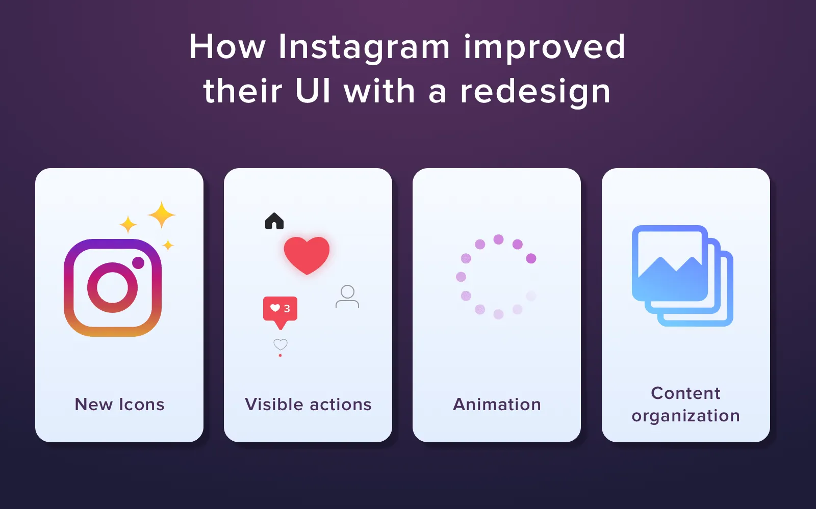
Instagram redesign
They used icons
You can see very similar icons in many apps and Instagram decided to adopt this technique as well. Icons are usually very basic and they are familiar to users so they feel it very easy to use them from the very beginning. It is all a part of the intuitive interface which we like so much. They help a user to navigate through an app easily. These unified icons make a new app very familiar.
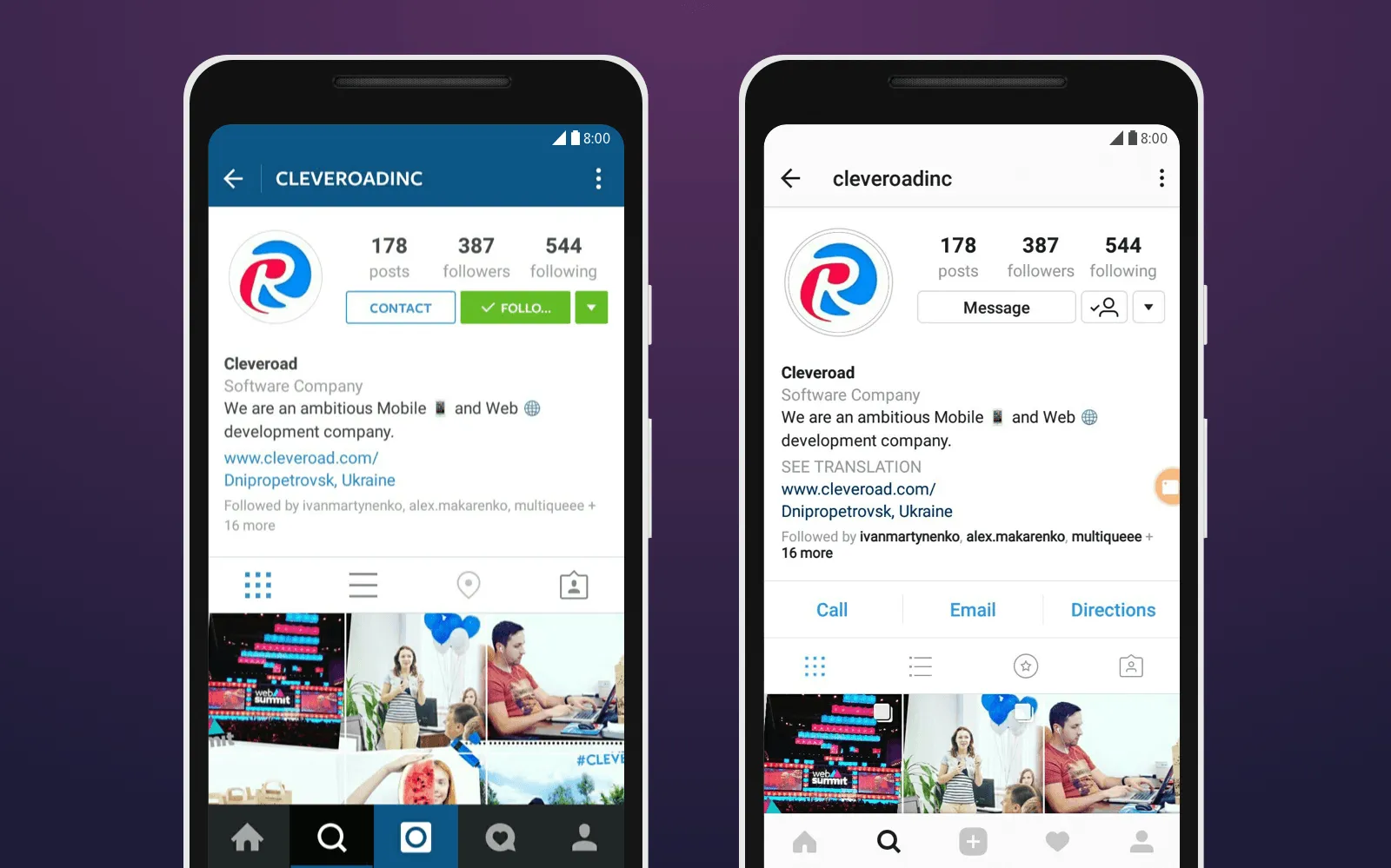
Instagram added new icons
Tip. When you are working on your UI and add icons to it, make sure that they all are easy to recognize and that each represents exactly the action it has to perform. If you use icons which do not perform any action, you also need to make them differ from the 'actionable' icons.
Made action seen
With a touchscreen, the UIs of mobile apps become more and more interactive. Before, we couldn't even identify what elements are active and which ones are not. Now, the elements change when we interact with them. They change colours, they can move and so on. Instagram used it as well. When you open the app you see whose stories you've already seen and whose not.
Soon we will publish an article about all Google trends for the upcoming year, don't miss it and subscribe to our blog!
Tip. When you think of what reaction an element in your app should have, think about something natural. How would a real object react if you touched it? Would it be a slight shake or colour change it's up to you, but test it before the implementation and make sure that it doesn't frighten people off.
Animation
The Animation is one of the latest trends in UI design and it is not going to lose it's position in the upcoming year. One of the most common options for animation use is a sign for loading. Animation also works great when you close a picture or a video without opening someone's profile. It brings lots of joy and also saves users' time.
Tip. When you add motion to your elements don't overdo it. Too much motion would make the whole screen shake and would only annoy a user. The elements should move the way they would if they were real. Think about the forces that influence our world like gravity or acceleration. It will make your app interface more lifelike.
Content organization
The way you arrange content in your app is crucial. If there're too many elements it looks messy. If there are only a few elements on a screen, a user doesn't have everything he needs. Before the redesign, Instagram had less content on one screen. Now, they added more. The problem here is not only to find this golden mean but also arrange in a way which would be the most convenient for a user.
Tip. If you have difficulties with content placement you can either open a similar app which you like (not as much as yours, of course) or you can read the comments and feedback your own users left in an app store to understand what improvements you can add.
Reasons to redesign your app
First of all, remember, it is only you to decide whether it is time to make a redesign or not. However, There are some attributes which you can recognize as a sign to make a step forward. You can read them below:
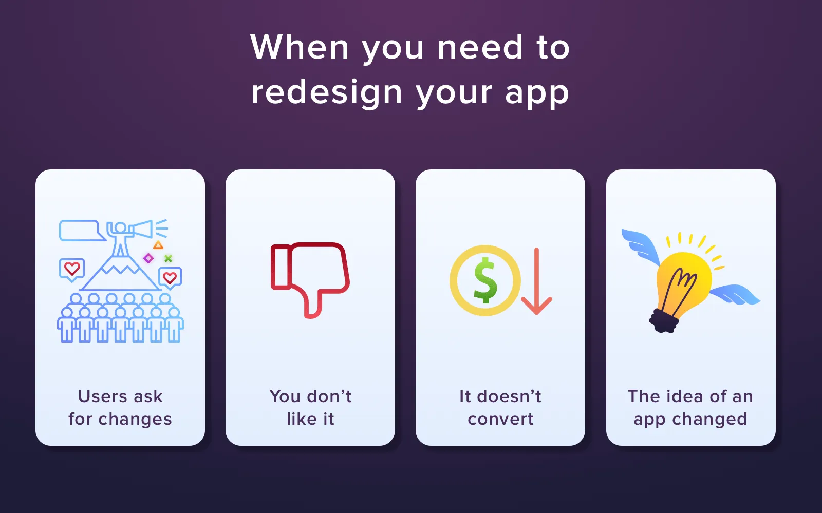
Instances when you need a redesign
1. Users ask for changes. If you keep in touch with your customers and read their feedback, you can notice that they complain about inconvenient buttons placement or that the UI looks plain and so on. Pay attention to the similar comments. If several users have the same complaints, you should start from these things.
2. You don't like it. What do you feel when you see the competitors' apps? Do you like them? Do you think that they are better than your app? If the answers are yes, and you do realize that your product is worse, you need to create a new design for your app.
Discover creative ideas for an app development to launch a money-making startup today!
3. It doesn't convert. Think about all the efforts you've put to create your application. I can only imagine how frustrating it is when your app doesn't convert and doesn't bring you any money. But don't think about it as a failure, it is your experience which is needed to improve an app. So, if your product isn't that profitable as it should be, it is a time to redesign!
4. The idea of an app changed. It happens quite often. If your app is pretty old and you made changes to it, for example, you added new features or products or services, the general idea of an app has shifted. And your new users don't get it from the very beginning. Of course, you want to work not only with some old users of yours but with some new too. So, why don't you make your app convenient and clear to them as well?
Rules to follow during an app redesign
There are still several tips and rules, which we haven't mentioned yet, which can work very well if you decide to redesign your app right now.
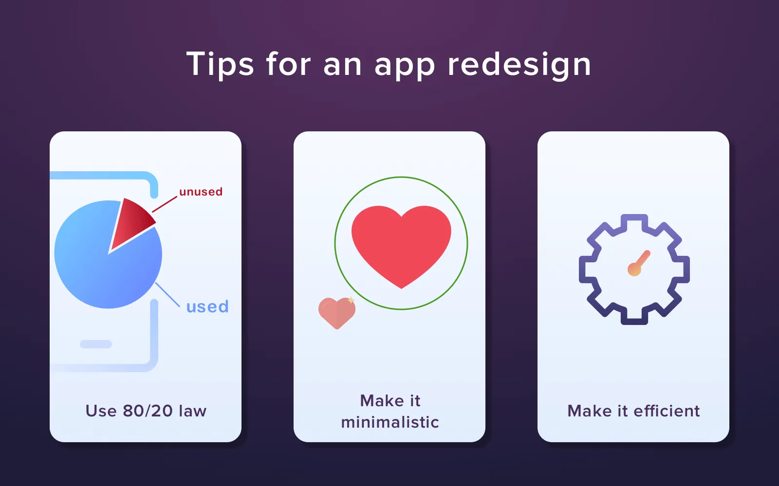
How to redesign a mobile app
Use 80/20 law
Your app has to be 80% efficient and 20% fun. People are not robots, they lose concentration very quickly so don't make them concentrate more than they want to. Don't make all elements active, don't place lots of information on one screen in order to keep it clear.
Make it minimalistic
Minimalism should concern not only the UI of your app but functionality as well. The point is you should group all the features into categories and hide them under one label. This will make the navigation much easier and more intuitive.
Still don't understand why you need to create a tablet app? Discover the reasons to start it's development right now!
Make it efficient
The fact that your UI will contain only a few elements does not mean that it will lose efficiency. The latest design trends teach us to use all available tools to make our app effective. For instance, if a year ago users had to input a password manually, now they can only press their fingers to a finger scanner or look into a camera. It saves both time and nerves (especially if you've forgotten a password). Using the built-in utilities of smartphones you can make your app much more productive.
A mobile app redesign is an essential step. Some product owners do not understand the importance of it and ignore it. In the end, they get a product without any conversion. It happens because of thousands of competitors who appear every day. Instagram, Facebook, Twitter and Pinterest are the most popular apps in the world. And we see that they redesign their apps and sites quite often. There is a reason for that! If they believe redesign can help them to increase conversion, so should you. Contact us to create a design which will make you rich!

Evgeniy Altynpara is a CTO and member of the Forbes Councils’ community of tech professionals. He is an expert in software development and technological entrepreneurship and has 10+years of experience in digital transformation consulting in Healthcare, FinTech, Supply Chain and Logistics
Give us your impressions about this article
Give us your impressions about this article