Splash Screen: Why Your App Needs One & Crucial Points To Follow
11 May 2018
11 Min
7168 Views
According to Google, 53% of mobile users will stop using website or app that is loading more than 3 seconds. That is why it is important to provide your users with the best user experience and make it possible to remove all bugs and errors while the page is loading. But, as a rule, users experience becomes much better if loading page contains some interesting design. Do you think that design of the page and loading speed have nothing in common? It turns out that it is a very important combination. So today we will pay attention to splash screen feature that is a graphical element you may require in the new mobile app development services. Why do you need it and how it works? All answers you will find below.
What is a splash screen and it's importance
A splash screen is an image you can see when app or web page is loading. Usually, you see the full screen covered with an animated picture or logo of a specific brand. it is a well-thought marketing approach since it is the start of your first acquaintance with the app loading. As for marketing, you can also be interested in influencer marketing trends for 2018 to promote your product, so mind to read it.
See why Flutter is a good tool to create UI. Read Flutter framework: a new robust tool to create native cross-platform apps
Today there is no precise information regarding the app that used splash screen first. But it was implemented with a strong reason in mind. A splash screen animation is necessary to take the time required for app loading. Moreover, advanced apps used a more interesting design of splash screen, for example, you could see all files that are loading at this moment. Previously, it was a vital practice since Internet connection was much slower, and, besides that, it has increased users' interest towards new product.
Application splash screen is just some kind of visual element that can hold or even entertain you for the time needed for an app to be loaded. The origin of the idea refers to the generation of opinion that the app is quick and responsive. When you don't see any screen while loading the app, it is likely that you will simply shut down the app after a few seconds of waiting, according to Google statement.
Why is splash screen necessary?
As a result, splash screen helps improve the user interface, enhance it's aesthetic part while maintaining the same functionality. So all important IT companies like Google, Apple and others started using a splash screen.
Don't you know how to improve UX of your website? Watch this video:
8 UX Elements to Create Trust to Your Website
Moreover, Google and Apple state that they use splash screen just to improve the UX, but not for promotion of their brands. However, most brands use their logos on both Android and iOS launch screen and it makes a good contribution to the promotional strategy of their companies. Every time users see the same logo, and it helps building up relations with the brand.
Slow Internet connection seems a relic today, any developed country can boast about high-speed Internet whether you are using PC or surfing the web with a mobile device. That is why Google and Apple changed their mind and came to a thought that a custom splash screen should be used only when it is really necessary. There is no need to add this screen to each app.
Google made it possible for you to find a detailed description of a wise splash screen creation in Material Design specification. Besides that, Android apps don't launch very fast, especially for the first time. There is a delay where splash screen can really help you catch the attention of the user. And this is the right case where Google recommends to use a splash screen. The user will be satisfied for sure.
Look at YouTube app below just as an example of Android launch screen:
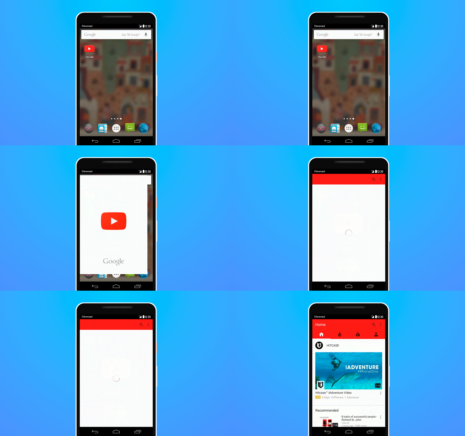
Splash screen of YouTube app
Watching splash screen requires the same amount of time the app needs to load. If you do it for the first time, waiting can take longer, but then it will take less time.
Splash screen: how it was used successfully
We already came to the conclusion that splash screen should be used with apps that are loading longer than usual or if you want to increase customers' loyalty towards your brand. Let's check out successful examples of splash screen design.
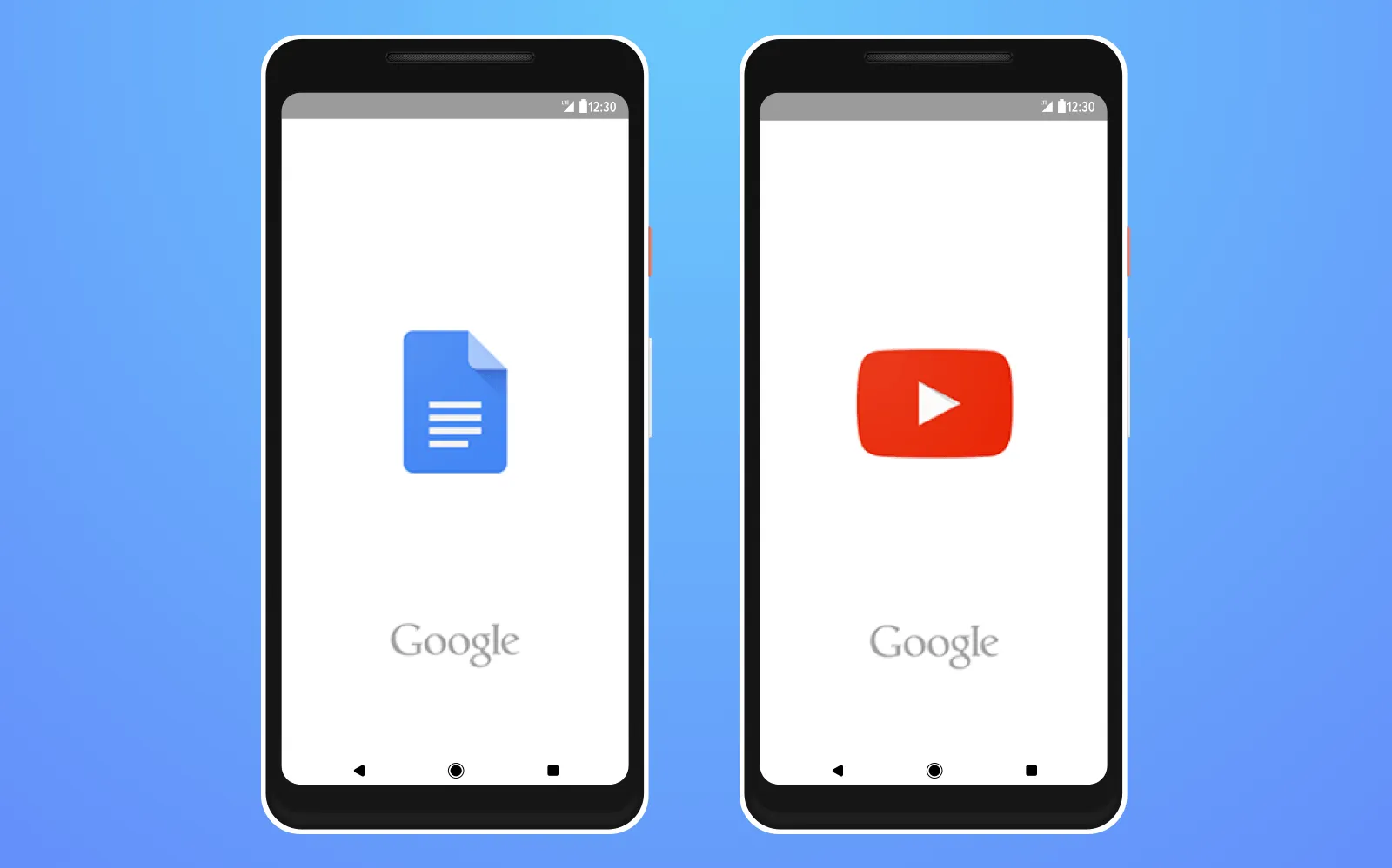
YouTube and Google splash screens
So, YouTube and Google Docs are the apps that need more time for loading, and they have relevant splash screens examples, as you see above.
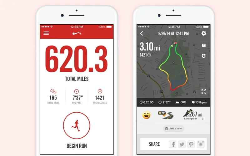
Nike splash screen with a racetrack
Reveal new logo design trends for 2024. Read 7 unexpected logo design trends for 2024 to follow
Nike + Running has a really fascinating mobile app splash screen since there is a red background with a white logo - this contrast is daring. Also, you can see a racetrack that shows the main goal of the app.
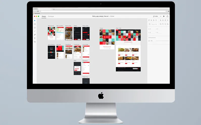
Adobe splash screen of web app
Above you can see what Adobe did when you are waiting for it to be loaded. It shows the process of loading and various pictures to entertain you. It allows the user to see that the app is loading, no hang or bugs occurred. It is highly important for a high-quality user experience.
SlidingTutorial from Cleveroad
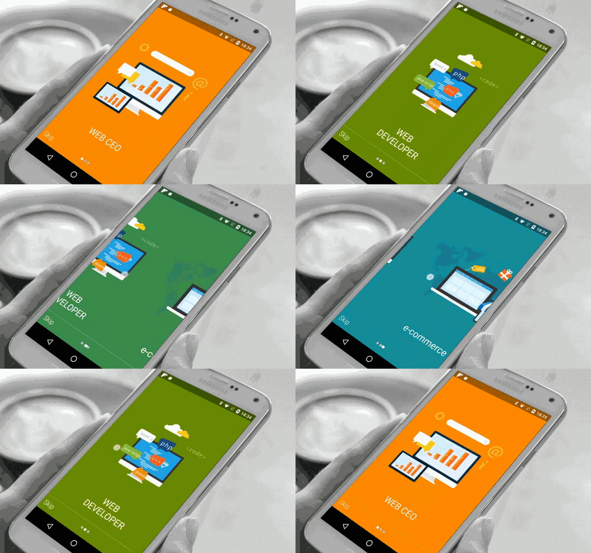
SlidingTutorial from Cleveroad
Keep in mind to give your user the confidence towards your app, so the loading process should be accompanied by app splash screen design with specific pictures or icons depending on your brand particularities.
Splash screen: to use or not to use?
There is no one certain answer to this question. Everything depends on a specific goal as follows:
- Definitely, yes, you should create splash screen it if your app needs some time to load. If there is a delay more than 5-7 seconds, you need a splash screen undoubtedly.
- Yes, if you have a large desktop app that also has complicated UI. Desktop apps can be run on an outdated PC where you will have to wait more than 3 seconds.
- No, if the app is loading quickly and you don't want to overload it with additional UI. If it takes less than 3 seconds to load, the user won't have time to feel the irritation.
Well, at Cleveroad we think that application splash screen can make your app more interesting and good-looking. And, in most cases, our developers integrate splash screen to new apps.
What should splash screen look like?
You will create your own splash screen, it is your decision. What should it be? You saw examples above and it helps you make use of their examples to apply them on the screen of your app.
It is important to consider some main items as follows:
Background
You choose any color you like, but, as you could see, a bright splash background can be beneficial. But, nevertheless, it is also a good way to choose a color from the color scheme of your brand. The more captivating is your color scheme, the better feedback you get from your future users.
Logo
Place your logo in the center of the screen. Think over the right color of the logo to make it contrast with a background. It will make your logo bright and visible for everybody.
Name
Add the name of your brand inside your logo or below it to make your brand recognizable. If you don't know how to name your business, find a good brand name generator of your choice.
Slogan
Why not add a phrase that will inspire or motivate your users? Many companies have it's own slogan on the mobile app launch screen. Thus, when the user opens your app for the first time, the slogan will reveal the main goal of the app. While the user will think over it, the loading process will be finished.
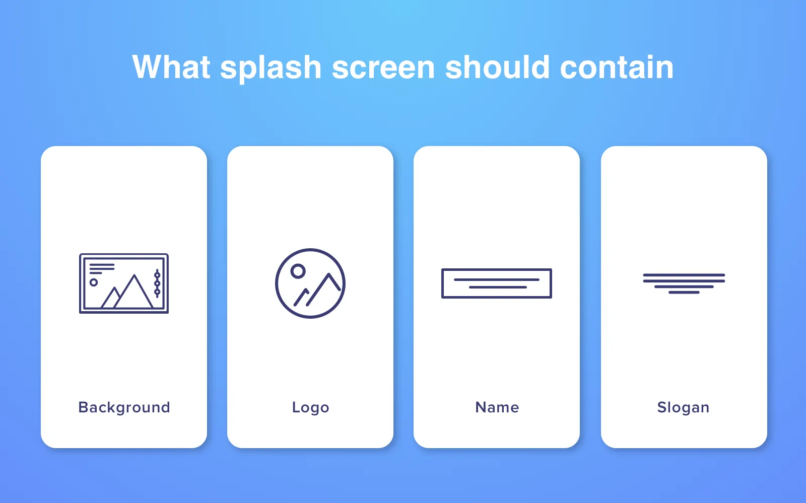
Important details for splash screen to contain
(!) Never use the following:
- advertising;
- a few splash screens;
- overloading with many elements that increase the delay.
Always use:
- Make splash screen with the presentation of your brand in a logo - that will be enough;
- Make loading process as quick as possible;
All important issues to consider if you plan to create a responsive design. Read Tips on creating efficient responsive design: when a responsive website prevails
And now, it is the time to understand how to make a splash screen. Our last but not the least point will show you how to do it.
Useful points to the right splash screen implementation
It is necessary for you to go deeply into the experience how to create a splash screen duly. So there are a few important issues you should not ignore when you plan to add a splash screen to your Android or iOS app.
Mind about screen resolution and size
First, keep in mind that resolution of your splash screen should appear in the highest possible quality. This is a very important factor for any splash screen design, and it has a direct impact on users. A placeholder of your app should function perfectly if an image with a high quality appears. But there is one problem - if you create a splash screen for iOS devices, there is no wide range of resolutions for these devices. But if it comes to Android app, it can bring more headache since there are hundreds of Android devices on the market. What is the solution? Well, there is one way: it is necessary to create splash screen in three sizes - small, medium and large ones. Our developers follow this rule if they need to create a splash screen for Android OS.
Don't complicate but ignore triviality
It is highly necessary to follow golden mean in your splash screen building. On the one hand, it shouldn't be too simple since it is the first what people pay attention to when they launch your app. But, on the other hand, a splash screen is designed to catch users' attention for a few seconds, no more than. So it shouldn't be very hard to understand, but triviality is not the option as well. If you are at crossroads, our specialists will help you find the right way.
Show users launching progress
Even if you chose a nice picture to be present on your splash screen, or you have a good logo or slogan, it doesn't mean that people will be 100 percent satisfied. So it would be better to add progress bar that will show loading process. When people know how much time it takes for them to wait until your app loads, they will feel more comfortable. Moreover, progress bar allows people to see that everything is working well, no crash is going to happen. Don't test the patience of users, and you won't regret.
Show your brand at it's best
As we noted above, the majority of companies use the logo of their brand on the splash screen and it is not a surprise. So here you need to get the best from your brand to astonish future users. Forget about copying of ready-made solutions from other companies. You can take their idea and improve, but simple copy-paste will not bring you success. Our UI/UX designers can give you a few interesting ideas that can show your brand in it's best design. All these simple steps can help you make a really amazing splash screen.
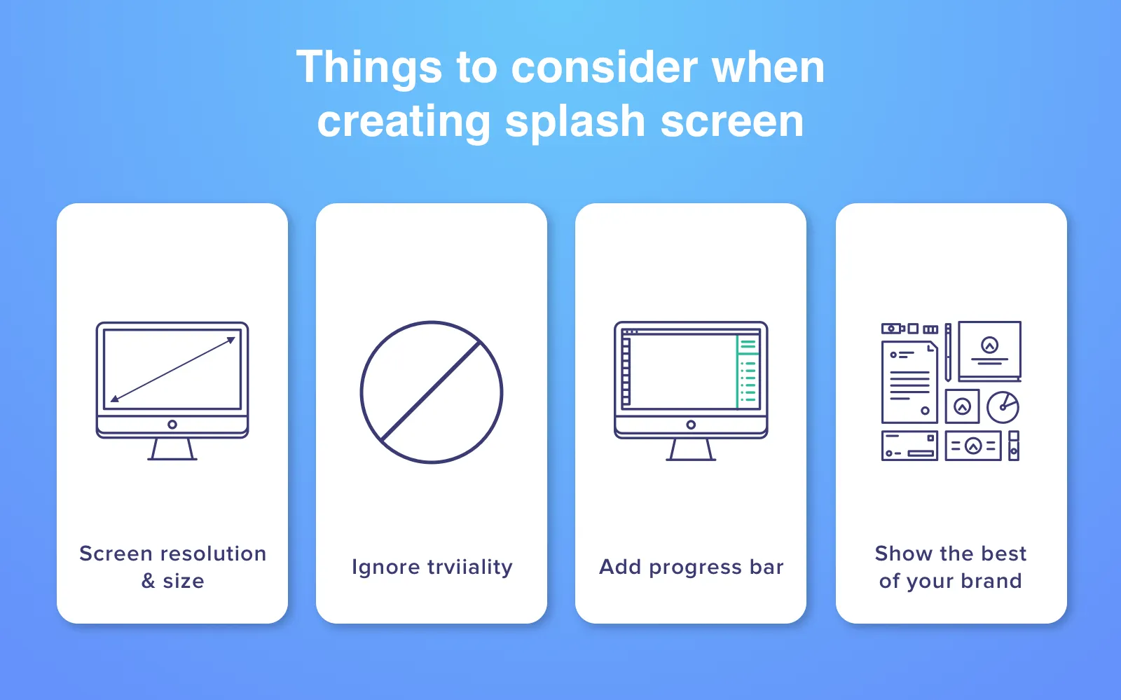
What you should know before creating a splash screen
This experience will give you real experience how to activate splash screen wisely and how to add splash screen to Android app. You won't waste the time of users, but they will be pleased with a nice view of your brand on the screen.
Learn how to find a good development team for your project. Read Guide for hiring a dedicated development team: insights from Cleveroad
Have you already intended to add your splash screen to your future app? As we said, we can help you do it and even share with you some tips how to implement it in the smartest way. If you saw some interesting idea that famous brands use in their apps - we can think how to improve them and use in your app's splash screen. Drop us a line right now, click a Subscribe button nearby to get our newsletters first!
A splash screen is an image you can see when the app or web page is loading. Usually, you see the full screen covered with an animated picture or logo of a specific brand. it is a well-thought marketing approach since it is the start of your first acquaintance with the app loading.
- Mind about screen resolution and size
- Don't complicate but ignore triviality
- Show users launching progress
- Show your brand at it's best
It is important to consider some main items as follows:
- Background
- Logo
- Name
- Slogan
Splash screens help improve the user interface, enhance it's aesthetic part while maintaining the same functionality. So all important IT companies like Google, Apple and others started using a splash screen.

Evgeniy Altynpara is a CTO and member of the Forbes Councils’ community of tech professionals. He is an expert in software development and technological entrepreneurship and has 10+years of experience in digital transformation consulting in Healthcare, FinTech, Supply Chain and Logistics
Give us your impressions about this article
Give us your impressions about this article