How to Create a Website Mockup to Make Your and Designers’ Life Easier
Updated 17 Oct 2022
11 Min
14790 Views
Don't judge a book by it's cover, is a nice proverb. It teaches us not to be arrogant. But when we open a browser we forget about politeness and just like every other user we demand the most urgent information, the best videos and the friendliest interface. Even if your website is going to offer the most exclusive content no one would read it without a perfect page design, because it's the cover of your site. In this article, we are going to find out how to create the best website with the best web design Mockup.
What is a Mockup for website?
Unlike a Wireframe, that is basically a simple sketch of a future site, the Mockup is almost a complete design. It displays not only the order of all the components but also the accurate colours, shapes and exact placement of the components, in relation to each other.
In order not to misunderstand the terms Mockup, Wireframe and a prototype, imagine that they are the steps to a final product.
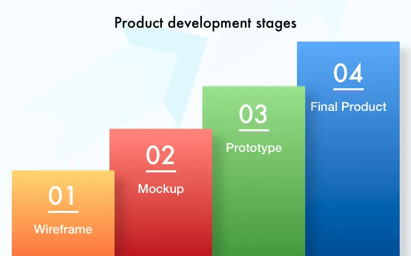
Mockup in a product development process
The first step is a Wireframe, it reflects only the elements that you need to have on your site and their places on a page. The Wireframe can be easily made by hand.
The second step is a web page Mockup. Here you have to choose the style, colour pallet, shape and design of all the components. Working on a Mockup, you can check how ergonomic the design is, as well as the overall view of a page.
A prototype is a clickable working product, which you can test. In plain English, it's a ready-made product but with a minimal functionality set.
Prototype is needed as proof of the concept, especially if you work with captious investors. If you want to persuade them that your idea is really brilliant, show them a prototype.
Mockup for website, why do you need it?
Of course, when you develop a product you will have a wireframe. The prototype is optional, however, a Mockup web design is a must. Why? Lets ponder how to make a website mockup and gain advantages that the Mockup creation brings to designers and a product owner.
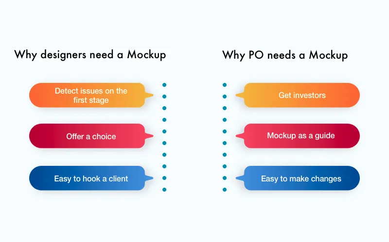
Mockup website development benefits
With the help of a Website mockup design, designers can:
Detect issues on the first stage
Sometimes the design which we imagined looks absolutely different in reality. When you turn the idea into reality you see all the downsides of the project. And at this moment, a designer can easily change any detail, it's style, size or colour. Exclude or add an element.
Offer a choice
The vision of a designer and a customer rarely match. And if a designer wants to offer other solutions, he can easily persuade the client having various options on hands.
Easy to hook a client
You can be the brightest designer, but it's so difficult to explain your fantastic idea in works. Yes, if you show the Mockup, a customer would understand your offer.
But the Mockup of website development is a great opportunity for a Product Owner as well, here is why:
Investors engagement
If you want to find investors for your project, you had better prepare a prototype of a product. However, it would be more expensive and there wont be any guarantees that the investors would agree. To minimize your expenditures, you can show a Mockup and the cooler it looks, the more chances youll have.
Mockup as a guide
When a customer gets a website page Mockup of his future product, and if he likes it, he understands how all the product will function. Now, it's a reference point so there is no need to change requests and add anything.
It's easy to make changes
When you look at the monitor you see whats wrong. This is too small, this is too bright and this button is too big. A customer gives specific instructions to a designer and that makes life easier.
The biggest advantage for all parties is that both will be happy after a collaboration. Designers don't have to make changes at the last minute and the customer really likes what he paid for.
How to make Mockups for website?
It's great if a designer has lots of ideas. Although to create a website Mockup, a really fantastic one, we have to think not only about aesthetic enjoyment but also about it's functionality. Users wont appreciate pixel perfect design if it's uncomfortable to use. The Mockup stands not only for beauty but also for the users comfort.
Do you remember how Mcdonald's was designed? Brothers Richard and Maurice Mcdonald drew a layout of their kitchen on the ground, schematically marked the order of all items and made their employees move like they were in a real kitchen. They detected the best trajectory for each worker according to the performed tasks. It was the first time when the design helped shorten food preparation time from 10 minutes to 30 seconds.
The story teaches us how important the design is for productivity. The buttons order as well as their sizes should be not only nice to watch at but comfortable to use.
Watch our video about Wireframes, Mockups and Prototypes and how they all serve to perfect the design:
It happens that you open a splendid website but cant find the button you need, or don't even understand it's purpose. When you create website Mockups they help detect all these issues, and show if the design is user-friendly or not.
To design a website Mockup that would fill all the functionality and make criteria more convenient, we need to gather lots of various information about the future product:
- What is the idea of the website, what features will it include?
- What services will the site provide?
- Who are the users of the future product?
- What is the average age of a user, what sphere the site covers?
- Information and the form the site will present it. What sort of content is the site going to include?
This data is needed not only for developers but for designers too. The designers would also appreciate if the customer shows them some similar web portals, to grasp the overall idea of the project.
After this information has been gathered, the design team starts planning. The more they plan, the better it is for the development process. As a well-considered created mockups for website reduces the cost of the product development.
At this stage the team has to answer the questions: will the design be responsive or adaptive, flat or material?
The other important issue that has to be planned in advance, is how will the mobile version of the site look. What content will be seen on a mobile device and what wont?
With the help of a finished quick website Mockup, a designer can explain to a customer why some elements were shrunk or deleted showing visual proof.
What steps you need to think through when you create website Mockups
There are some common rules which all designers should obey if they want to make simple website Mockup design that will attract, hold and direct users attention.
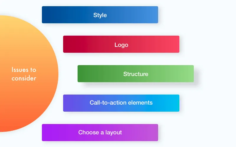
Mockup development basic elements
Style
After you have chosen a style, follow it. It's unacceptable to mix elements from different colour palettes. The user will notice it.
Logo
A designer should create, place and adjust the size of a logo in a way it will be seen at first glance but not to create an eyesore.
Structure
Use a grid to make the content loud and simple. Well-structured information is always much easier to perceive.
Call-to-action elements
The buttons that recommend buying or subscribing or contacting the company have to stand out. They have to look attractive in order to make a user perform a particular action.
Choose a layout
Modern design offers three main types of layouts to place important elements, according to the way the user scans a web page. You can choose between a Z-pattern, F-pattern or a Gutenberg diagram layouts. Your choice should be based on the type of website you have and the content you have here.
Common mistakes when you create web page Mockups
As well as the crucial elements, there are the pitfalls you need to take into account while developing your fabulous Mockup website design:
Too many details. Remember one rule- the less the better. If you hesitate about an element - get rid of it, you don't need it. The web page should include only needed elements, which you cant work without. Don't make the same mistake as the creators of this page.
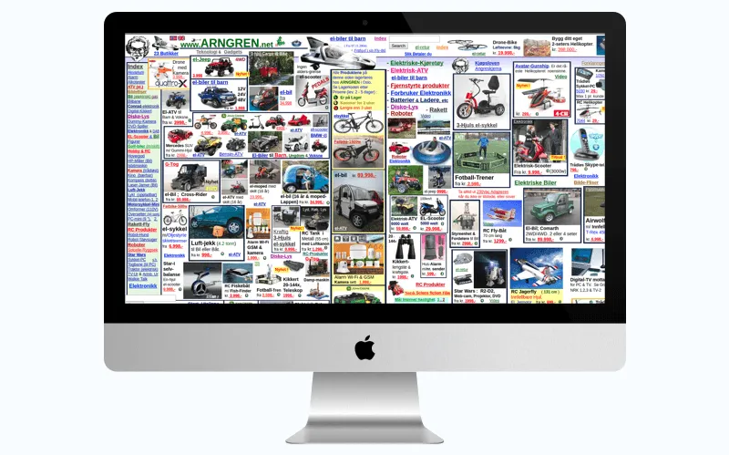
Mockup mistake - too many elements
Wrong colours. Always use a colour scheme to choose only matching shades. The majority of all modern website Mockup tools for Mockup creation already have a feature to pick the right, matching colours.
However, if you use inappropriate website Mockup software to create your Mockup without a feature to choose the colour palette, you risk to create something similar to this:
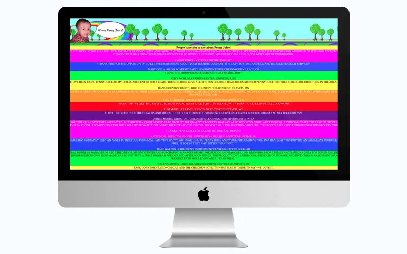
Mockup mistake - wrong colours
And it refers not only to the colours. I know that a lot of novice designers believe, that PhotoShop is a nice instrument to create a website Mockup. Well, the idea is wrong, because PhotoShop cant show such effects as rollover or animation. So think wisely when youre choosing an instrument for this work.
Unreadable text. The colour of your text and the background define how easy it will be to read your text. The best option is a dark text on a light, sole-coloured background. In case a user finds it difficult to read your text, he would close the page immediately. The bright colour of texts or fantastic, extravagant fonts may turn your design into this:
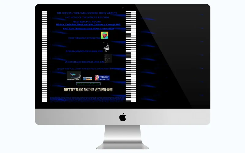
Mockup mistake - unreadable text
What else you need to consider is how to create a mockup website that will look the same on different screens. Imagine that your site can be viewed on a smartphone, tablet, computer and even a large screen TV. And you need to think about how pictures will look in every case, how should the text be organized and what will happen to the background.
Use the touch. The ability of modern devices to react to touch is a fantastic chance to make an attractive website design within UI/UX design servcies. In a mobile design place, the clicked elements are in the lower half of a screen. In the layout for tablets, these elements should be ordered in another way, in the area where a user can easily reach it with his thumbs.
Don't forget about the links. The reason you add them into your content is to give users a chance to follow it. If a user doesnt see it - it's worthless. The links should look differently to serve their purpose.
In conclusion, wed like to say that it's not difficult to find a nice designing Mockup tool for web applications or a Mockup website builder and create website Mockups of your future website on your own. However, after you have done that, think if it's really what you need? Is the logo of your company seen at first glance? Is it easy to read the text? Does the design behave on different devices with different resolution the way you need it to? If your answers are yes to all the questions, I can only congratulate you. Yet, if you have any doubt, you had better ask the professionals to take care of your future web portal. In a case you want to get a nice-looking, high-quality, user-friendly attractive and appealing web design, contact us and tell us more about your idea.
Creating a website mockup requires precise planning. Firstly, you have to understand the idea of your website, what services the site provides, your target audience, and what sort of content will this site display. Then, designers should decide whether the design will be responsive or adaptive, flat or material. After all these stages, designers can proceed to creating a mockup.
At first, you should have an answer to a number of questions. The most common of them are:
- What is the idea of the website, what features will it include?
- What services will the site provide?
- Who are the users of the future product?
- What is the average age of a user, what sphere the site covers?
- What sort of content is the site going to include?
Also, designers have to follow some strict rules. It's obligatory to follow a unified style. You can't mix elements from different color palettes. Also, designers should create a website logo and place it on the mockup. As for the structure, you have to use a grid to make information easier to perceive. At last, you have to choose a layout. The most common are Z-pattern, F-pattern, and Gutenberg diagram. They differ in a way users scan the web page.
Mockup is almost a complete design. It displays not only the order of all the components but also the accurate colors, shapes and exact placement of the components, in relation to each other. Here you have to choose the style, color pallet, and design of all the components. Working on a Mockup, you can check how ergonomic the design is, as well as the overall view of a page.
Logo and call-to-action elements are integral parts of website mockup. Also, mockup should contain essential UI elements like dropdown lists, search forms, buttons, etc.
The mockup is needed to check the convenience and usability of the website's UI. Designers use it to understand how to make a web page look more attractive, and how to place elements to increase user experience.
The Mockup is almost a complete design. It displays not only the order of all the components but also the accurate colours, shapes and exact placement of the components, in relation to each other.

Evgeniy Altynpara is a CTO and member of the Forbes Councils’ community of tech professionals. He is an expert in software development and technological entrepreneurship and has 10+years of experience in digital transformation consulting in Healthcare, FinTech, Supply Chain and Logistics
Give us your impressions about this article
Give us your impressions about this article