Suppose you have developed and launched an app or website, but the user ceases to use it right after downloading. It's not as improbable as it might sound. Google estimated that every fourth of all installed apps are never used. Even without facing this problem directly, we all can totally relate to it and think about possible reasons. If a quick analysis reveals nothing is wrong from the technical side or with a target audience choice, it is highly recommended to look at your website's UI design.
UI design is responsible for the retention rate on your app or website and is similar to the article introduction. It determines whether the user will keep exploring your product or leave the page without delay. Knowledge about current UI design trends is essential to make the design both attractive and intuitive through every click and during every scroll.
In this article, we'll tell you about the ways of making apps and websites user-attractive from the first glance in 2025 that are shaped by designers and inspired by users.
Why Do You Need to Be Aware of UI Trends?
In a nutshell, the UI design is responsible for the look of your webspace or application and normally narrows down to mockups and animations, or motion design. But in fact, it is far from being limited by it. Similarly, UI trends do not just happen; they derive from the conclusions that designers make based on user behavior and feedback. Each UI design trend reflects the method of presenting apps and websites in today's most effective and efficient manner.
To give things a wider perspective, let's consider precise ways of how you can apply your awareness of the latest UI design trends in your digital business strategy.
How UI design contributes to your business:
Boosts Customer Acquisition. UI design that complies with the latest UI design trends is your best tool for engaging new customers. The step of engagement is crucial as it launches the whole mechanism of the purchase funnel, enabling every further step of it. That is why the extent of UI design's usability directly correlates with the level of revenue.
Increases Brand Awareness. Customers will remember your brand thanks to the UI design's ability to stick in the memory or forget it if the opposite is true. As only those design decisions that contribute to the eye-catching brand presentation become trendy, familiarizing with new UI trends is always a wise and proactive idea.
Raises Competitiveness. Another benefit of the appealing UI design is the competitive advantage it provides to the e-business. Efficient and attractive presentation of the brand's authenticity ensures its ability to stand out among competitors. To that end, it is important to be familiar not only with a trend itself but with a wide range of its applications. This information is key to the flexibility of the design means that will allow you to stay trendy and avoid the mainstream.
Enhances Trustability. A digital platform with up-to-date UI design makes your business look professional and trustable in the user's eyes. In today's constantly changing world, the ability to progress and innovate is a synonym of reliability. That is why implementation of the latest UI trends will help you significantly increase brand loyalty and trustability.
Ensures Better Customer Retention. UI web designers imply user interface design trends to simplify the research and navigation process. A smooth customer journey with minimum to zero frustration moments is key to a high retention rate. Additionally, understanding how to make your app or website user-friendly according to today's agenda will help decrease search time. Such an approach will contribute to the growth of customer journey productivity and, again, better customer retention.
Increases Conversion. Customer conversion also largely depends on well-ordered UI design. Choosing a proper UI trend is crucial for creating the right approach to your target audience's heart. Eligible UI design provides you with an opportunity to target the audience precisely in an applicable niche.
Cuts development costs and effort. Finally, adjusting your web design to UI trends 2025 is a great way to cut expenses on frequent updates and customer support. Speaking of design, it will stay up-to-date for a longer time by complying with the requirements of the modern-day from the very beginning. In addition, when the user interface is clear and easy to understand, it prevents users from having issues based on navigation lowlights. When the customer gains fewer concerns, this means the CS team is contacted less frequently, and you have smaller service costs.
Get the most out of UI solutions?
Our design team will create a custom UI for you, considering your business model
Now that we have discussed the main reasons why learning about current UI trends is useful for your business, it is high time to talk about the exact choices of new UI design trends in 2025.
UI Trends in 2025: Top 12
- 90s retro nostalgia
- Visible grid
- Hand-drawn elements
- Focus on Typography
- Animated logos
- Round corners
- Tabs and layers
- Stop-motion animation
- Fonts and typefaces medley
- Button cursor
- Battered images
- Multiple scroll directions
90s Retro Nostalgia
Though time is unstoppable, and we can never get the rampant decade of the 90s back, its repercussions have not been forgotten. Quite the opposite, right now, the 90s era experiences a new burning among the hottest trends in UI design.
The power of nostalgia
The marketing potential of nostalgia has been known and embraced by multiple companies around the world for a while now. There are many reasons for the marketing effectiveness of nostalgia, but regardless of which one is applicable, the fact remains the fact: people like to reboot periods. Today's retro paradise we feel nostalgic about is the 90s.
Track of progress
The 90s era embodies an early digital culture of dial-up Internet. What pops up in mind here are interactive clipart elements, clunky overloaded backgrounds, and looped background music. Of course, now we do not see any of those often. Still, designers leverage 90s trends to use them today in a modern interpretation with the power of modern-day technologies.
Wide range of aesthetics
Combining such utterly contrasting components as grunge and anti-design on one side and pop culture on the other, the 90s aesthetic is rich and diverse. Among the elements that you can draw on are dirty backgrounds and distressed fonts, bright and chaotic patterns, tables-like blueprints, along with robotic typefaces, hand-drawn doodles, along with 90s cartoon or game characters, like CatDog and Mario.
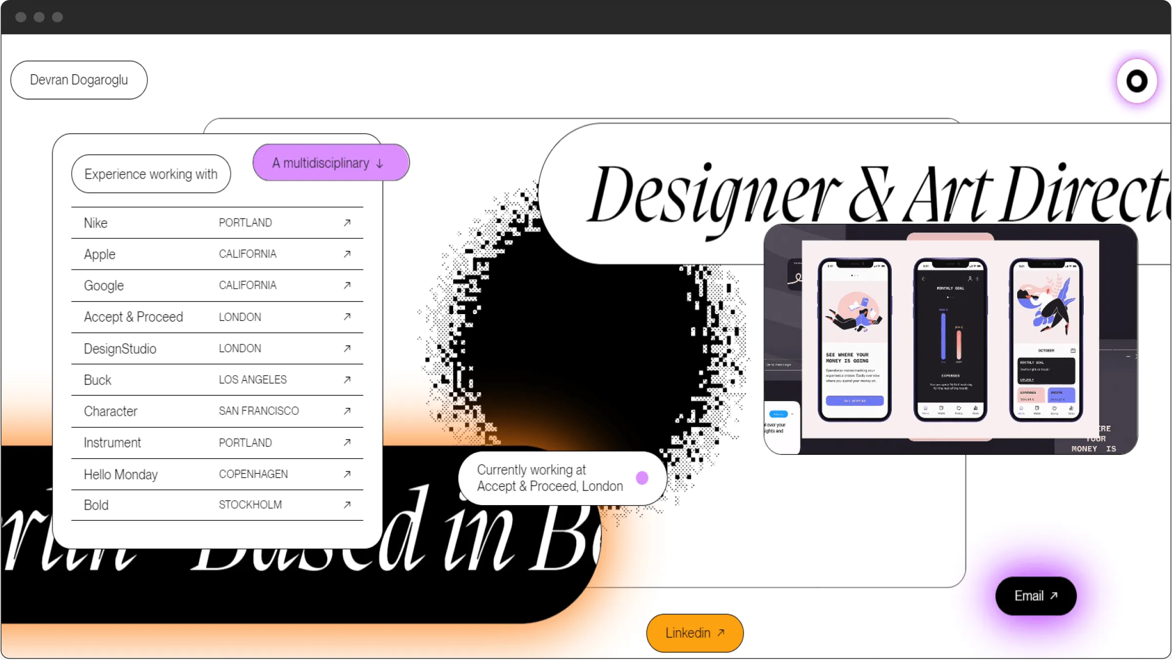
90s retro nostalgia
Visible Grid
The next most popular of UI new trends is the visible grid. Before becoming a trend, grids used to be commonplace in the web design division for a long time. However, in 2025 things changed. Before 2025 web designers used to keep the grid barely noticeable, while today, thick lines and pops of color have become this element's permanent attributes.
Let's look at the benefits that this trend can bring to your digital space.
- Better Order. The first benefit of the visible grid is that it makes big amounts of data look well-organized and minimalistic. A vivid block pattern of elements ensures a faster scanning process, hence allowing to display more content without the page feeling overwhelmed.
- Clearer Customer Journey. A simple and intuitive customer journey is key to a high customer conversion rate. The vivid grid pattern of the web page helps organize the data in a lucid and logical manner so that customers would not experience confusion at any of the steps of their search for a needed service.
- Effective Division. A visible grid will be a sharp design solution if you need to divide sections from one another and structurize information across the website. Designers now tend to use natural shapes of grids, geometric and bold appearance.
- Emphasis on Simplicity. Grid lines can be used in multiple ways across the website. Designers use grid layouts to make the geometrical look stand out across the site or an app.
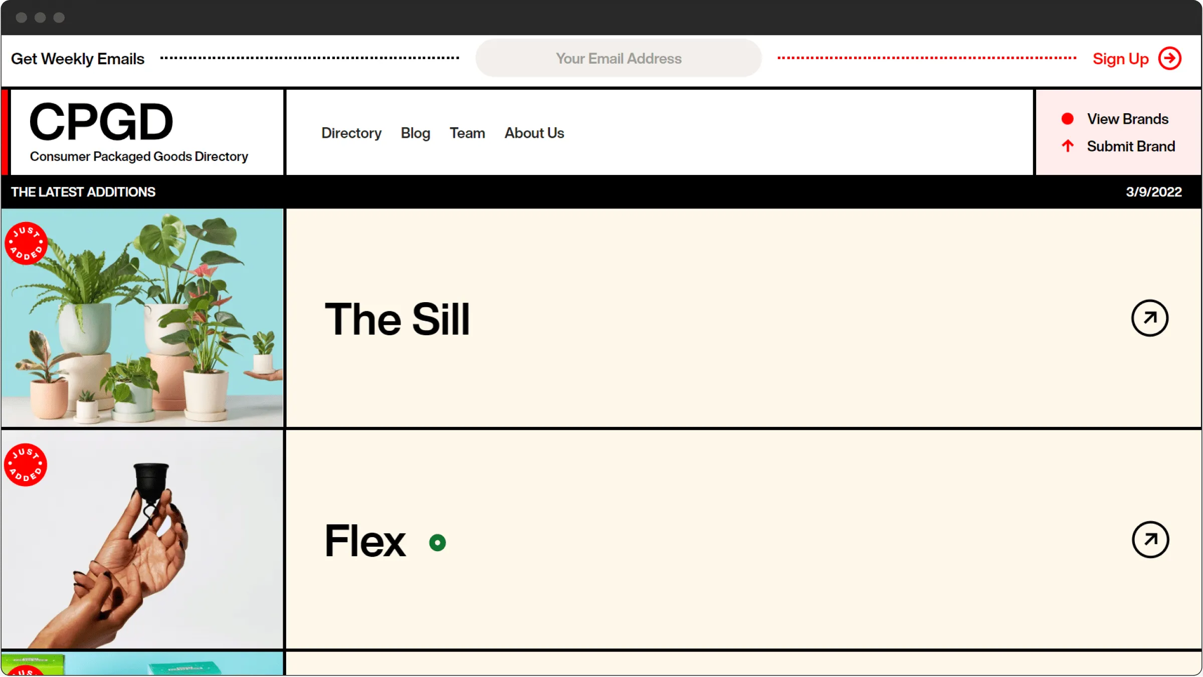
Visible grid
Hand-Drawn Elements
Hand-drawn images have always occupied a special place in web design, but only in 2025 did the UI design trends list have illustrations in its avant-garde. Their benefits:
- Authentic Look. Hand-drawn images require more time and effort to ensure a natural appearance and avoid messy, inaccurate looks than graphic images. However, hand-drawn elements look more authentic than even professional photos, not to mention stock images.
- Competitive Advantage. Besides, applying this trend gives your digital product a solid competitive advantage as it means a 100% guarantee that your content is unique and no other app or website uses it.
- User Attention Management. This trend is not just about originality; it is also about the well-ordered organization and convenience of the user interface. Hand-drawn images help to direct user attention across the website, pushing and pulling it as it suits the goals of your app or website.
- Details Highlight. Hand-drawn images also allow you to express your business message with greater freedom by widening the range of accessible means of communication. The method of illustrations is great for naming precise product characteristics. You can use hand-drawn illustrations to emphasize peculiarities and advantages.
- Users' Emotional Feedback. Emotional images can also contribute to increasing customer loyalty by connecting with your visitors on an emotional level.
- Composite Images. Another layer of this trend is the tendency to create composite images, which combine illustrations with real photos. This method is perfect for hero pages. It allows creating a really authentic perspective that draws attention.
Depending on the effect you want to achieve, you can use scratches, underlying, abstract forms, hand-drawn icons, etc. The trick is in overcoming the gap between online and offline with the help of human touch.
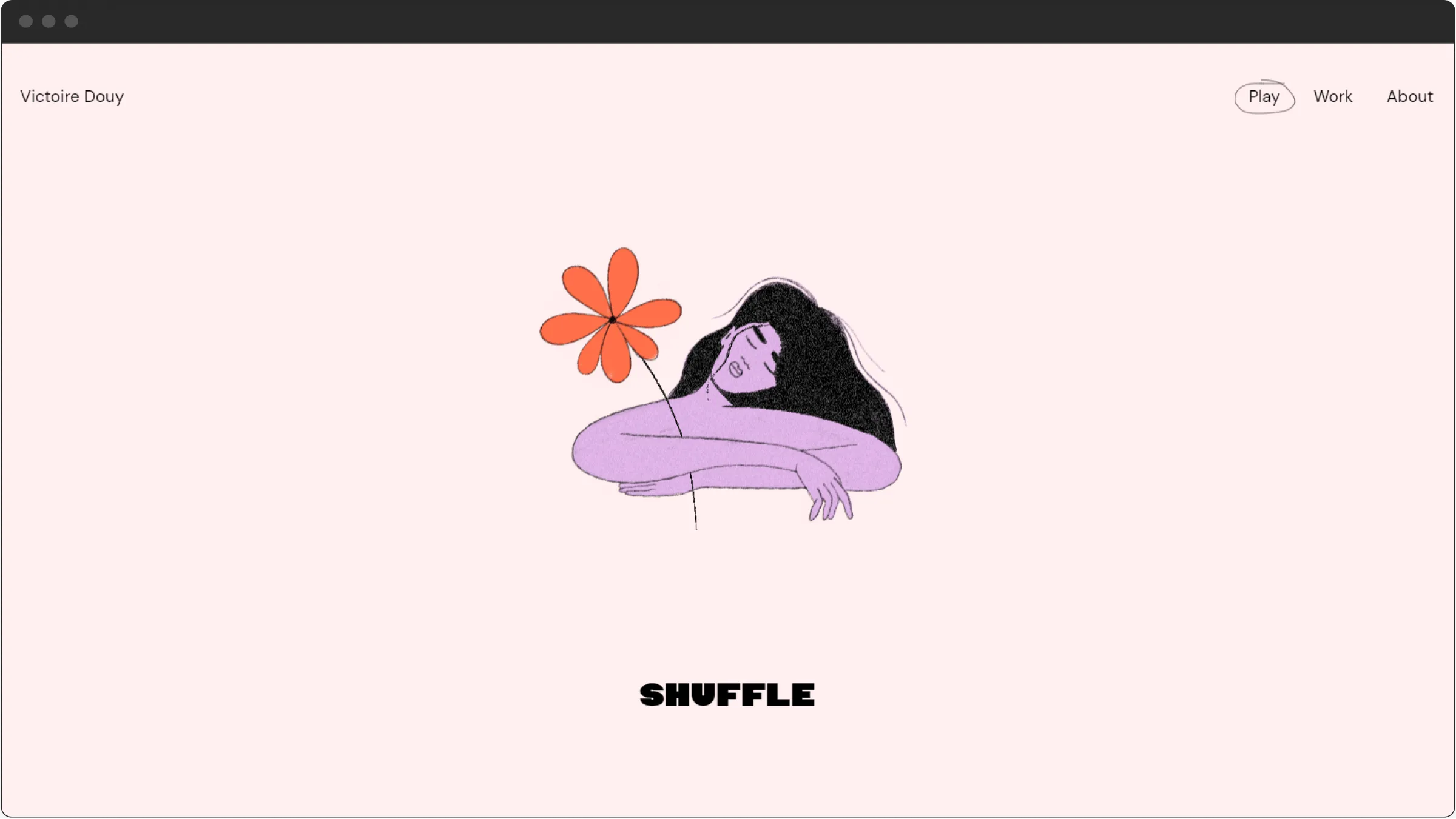
Hand-drawn elements
Focus on Typography
There is no wrong or inappropriate way of typography nowadays. The scope of 2025 UI trends combines old-school traditional with modern-day approaches, plays with styles and formats while also not being immune to epic comebacks.
Vivid features of the trend are:
Independence
Today web designers pay more attention to the power of typography. On many apps and websites, we see printed content used as a lead element rather than subsidiary to images. Using typography in a hero image brightly showcases this trend. Such a textocentric approach reveals another tendency when UI design features bring the company's motto to the front in the word format.
Combinations
Among current UI trends, combinations of different typography styles and formats are also present. Instead of using typefaces or fonts, designers mate italic with regular typefaces, contour style with monospaced ones, large bold fonts, and serif typefaces. This synthesis process is not immune to any experiments. To this end, increasingly, more and more brands create their own typefaces.
Interaction
Another aspect of this trend is about using typography to ensure better interaction with the user. For example, filled text can be used for attention-grabbing purposes with strategically important text pieces while applying outline format for the rest of the content. Besides, this trend is a great life hack for web designers as it allows sparing time and effort resources while using only one font in two or more variations.
Gigantism
For this UI trend, 2025 has literally become a time of growth as designers go beyond the style and format of typography and experiment with their size, too. Gigantism implies text covering the entire screen of a smart device, thus giving it more value and a sense of impact.
Brutalism and Neo-Brutalism
Brutalism is characterized by certain rudeness and inaccuracy. Initially, brutalism blew up in Britain as an architectural style in the 1950-the 1970s, and nowadays, UI web designers use it to grant typography a raw and sort of incomplete look. However, the main goal of brutalism in UI design is the natural and functional disposition of objects on a screen. This trend is representative of a wider tendency of art genres' transition to the digital space as it leans into meta format.
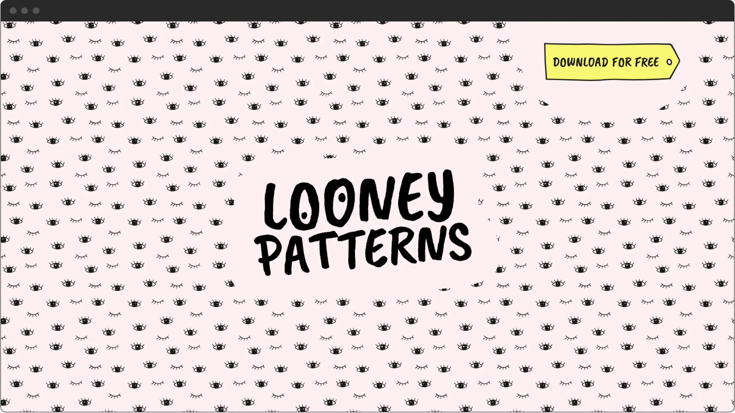
Focus on typography
Animated Logos
In 2025, visit cards, notebooks, and brochures are not going anywhere as animation has nothing to do with polygraphy. However, when it comes to the digital presentation of business, animated elements embody one of the hottest trends in the user interface division of web design.
Here are a few advantages of animated logos from the design and marketing perspective:
- Greater Brand Awareness. Animated logos is a reply of web design to the request of businesses to refine their brand identity and make their online presence really unforgettable. Changing dynamic elements are exciting to look at as they create an impression of a short cartoon.
- Positive Brand Image. Motion design used for the user interface is an eloquent and persuasive sign of a modern-day approach to your business. Animated logos are associated with the brand's ability to meet the challenges of time and effectively assist their customers with doing the same.
- Better SEO Ranking. Google puts dynamic content over static icons and typography. In addition, pages with unexpectedly and hence excitingly moving elements are better for the purpose of user acquisition.
- More Aesthetic Look. This point is not sophisticated at all. It is as simple as that: logos made with the help of motion design just look better. Although each of the current UI trends is called to make your web space look more attractive, animations focus on the aesthetic side more than user convenience or any other moment.
- Storytelling. In addition to other benefits, animated logos act as perfect storytellers for your business. They will introduce your brand's mission and its values in a clear and unique manner in a matter of seconds.
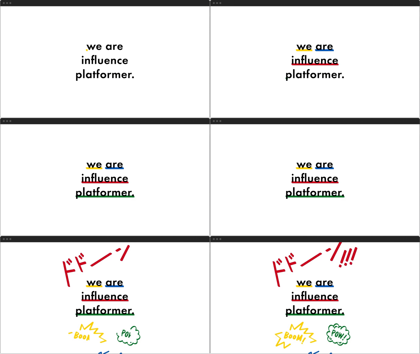
Animated logos
More Web UI Trends
Above, we have considered those user interface trends that are a buzzword in the current digital realm; however, there are much more of them. Below we've listed the trends in UI design that are less widespread but not less beautiful and handy for ensuring greater visibility of your product for those who will scour the Internet in search of it.
- Round corners. Round colors enable more smooth line transition and, as a result, a milder organization and general look of the user interface elements.
- Tabs and Layers. This trend is all about a more exquisite and exciting texture of your website — take a look at the website of the actress Eva Habermann.
- Stop-motion animation attached to the scroll. An eligible animated element accompanying users through their search on your website will add up a portion of excitement to the customer journey (take a view at Hyperframe).
- Fonts and typefaces medley. Mix & Match fonts and typefaces whatever you like; nothing would be too much in this case — visit DFY's website to make sure.
- Button cursor. Dormeuil is a great example here.
- Battered images. Check The message to Ukraine by Obys agency.
- Multiple scroll directions. The vivid example is Browserhistory
Want to know how much does it cost to design a website? We’ve made a special guide about it!
Reasons for a Website or an App UI Redesign
Now that we've taken a look at the current trends in UI design, it's time to consider when exactly to implement one or two of them in your app or website.
You need UI redesign if:
The UI of your product is overloaded
Regardless of which UI design trends 2025 offers to us runs the show at the moment, minimalism is an all-time timeless classic and smart idea. So if your landing page or a screen in your app is chock-full of details, buttons, and other elements, this may be the reason why you are constantly losing your potential customers. If you are not sure, ask your users. Ask them to rate your product and tell what they like and don't like about it. Your target auditory is the most respectful judge for you.
You want to make your product competitive
There are almost 3 million mobile applications in Google Play, lots of iOS apps, and websites. Every day new, beautiful products appear on the market which means that you have to work really hard to stay afloat. If you take a look at some of the most popular and commonly used applications and sites which have been on the market for a long time, you'll see that all of them keep up with the time, their design and functionality changes periodically offering users new, more convenient ways of interaction with their products and services.
Your product works slowly
Tardiness of the website's rendering is what frustrates consumers the worst. This tendency is so common that it has become an axiom that every e-business has to take into account. Quite naturally, nobody likes to waste their time, and due to the diversity of choices, it often seems easier to switch to a faster-working website than wait another second.
UI and UX design are some of key factors that determine the speed of your site. That's why adjusting web design to the trends shaping user convenience today is simply imperative. To check whether your site speed stacks up, you can use dedicated tools like GTmetrix. Here you can not only see the weak sides of your website but also check the site of your competitors to see the full picture.
Find out what are the leading UX trends of this year by reading our recent article
Your business has changed
If your website or app, which used to sell products for hunting equipment, now sells only fishing gear, it is time to redesign it. Even if the change is not so radical and touches only one or a few. Sometimes, product owners add new features to their application or a site which is good actually, but they forget to change the design, and all the changes go unnoticed. A fresh, updated design can show how POs care about customers.
Your product is old-fashioned
If your application or a website was developed a few years ago, its UI design is most certainly out of date by now. Therefore, two options are possible here. In case your site or app targets older customers, and this is a category of people with a low tolerance for any kind of change, there is no need for a redesign (unless the case mentioned above takes place). However, if your e-platform targets kids, teenagers, middle-aged people, entrepreneurs, or any other socially active people, then an old-fashioned UI is demanding a serious upgrade right away.
The clock is ticking, and today's innovations are tomorrow's trash. Still, it doesn't mean that you have to follow each of the latest design trends in UI redesigning your application or website accordingly every month or even every year. What really matters here is listening to your audience. Give them all tools to contact you, rate, and comment on your site or app. Thanks to that approach, you will know when it's time to breathe new life into your webspace directly from its users.
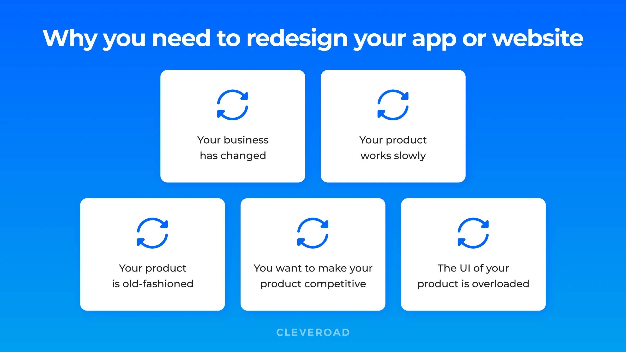
Reasons why you need to redesign your app
Cleveroad — Software Solutions With Innovative UI Design
Cleveroad is a professional software development company located in one of the most popular regions for the outsource — Central Europe. Our company has decent experience in various fields, including Healthcare, FinTech, Logistics, and other domains. We assist with getting a full-fledged software product to more than 170 companies, both start-ups and established businesses.
When working on our clients' projects, Cleveroad exercises an approach that addresses UI and UX design as a complex inseparable structure. Here are the 7 steps we take when meeting our customers' design needs:
- A project plan building
- Research and sketching
- Define how to create wireframes and implement yours
- Homepage navigation and layout building
- Additional website elements design
- Color scheme and typography
There are some basic points to consider when calculating the cost of the website's UI/UX design, as well as app design cost. They are determined depending on the client's individual requirements and the types of service required.
The stack of the design services provided by Cleveroad our clients includes but not limited to:
- Ideate & Mood Board
- Branding & Graphics
- Colors & Accessibility
- Icons & Typography
- Layout & Design System
- Visual Design
With more than 10 years of experience in UI/UX design, Cleveroad has established itself as a leading rating&review choice at such world-known platforms as Behance and Dribble. We are proud to place our portfolio on highly credible platforms so that you can glance at examples of what we do and start creating your product’s design with us!
Use cutting edge UI trends now
Book a consultation with leading UI/UX designers with 10+ years of experience
UI trends are the latest techniques and technologies that help create user-friendly interfaces for software on all devices. What are new Ui design trends using this year?
You can always be on the cutting-edge of new UI trends if you:
- Participate in continuing education
- Read books and magazines about UI design
- Read blogs and follow famous UI design influencers
If you follow UI trends you can easily acquire benefits like improved mood thanks to optimized color scheme, raise trustability and facilitate the use of your app or website.

Evgeniy Altynpara is a CTO and member of the Forbes Councils’ community of tech professionals. He is an expert in software development and technological entrepreneurship and has 10+years of experience in digital transformation consulting in Healthcare, FinTech, Supply Chain and Logistics
Give us your impressions about this article
Give us your impressions about this article
Comments
1 commentsHi there, I enjoy reading through your article post, I wanted to write a little comment to support you and wish you a good continuation All the best for all your blogging efforts.