Web Design Process: 7 Steps On How We Create Websites Appearance At Cleveroad
Updated 18 Aug 2023
11 Min
8817 Views
Website designing is not less a responsible task than creating a design for mobile apps. Our UI/UX developers apply their skills to create an attractive and amazing website. The process of web designing can take from a couple of weeks to a few months, depending on a website type and it's complexity.
This article we would like to dedicate specifically to UI/UX services for web products, in addition to the article about mobile app design process at Cleveroad.
Web design steps: a detailed instruction from Cleveroad
We would like to note that websites design process steps are almost the same as those for building a mobile app design. But anyway there are some differences we would like to highlight and share with you, so you will immerse deeper in the process of UI and UX building for websites.
Step 1. Build a project plan
How to make a good website design? Of course, everything starts with planning, the first stage where we build a design plan. If you start creating web design without a plan, you won't know what result you will achieve in the end. So it may lead to a simple loss of time and money.
See what you need to build a website. Read Web development cost
- Before we proceed to the designing stage, we should study the project. We discuss it with our customer to understand his or her requirements;
- We discover what brand the website should promote, whether it should be a website that promotes sales or the customer simply needs to attract more attention to the brand;
- Then, we study the features that a future website should contain, to determine an approximate design. Also, we should know the target audience of the future website provides the audience with what they exactly want.
This information will help us build a good website design and avoid unwanted mistakes and revisions.
Step 2. Research & sketching
When we've completed a planning stage, we can move to the research stage. We can check out other existing websites to see how they are made, what elements are used there, and we can discuss with the customer whether relevant websites can be used as an example for his or her custom website or not.
Besides that, we always give a hint to our customers that they should always know their competitors. It means that we study and analyze competitors' website and make a decision on how we can make our website design better and more appealing.
As a result, we can make a few sketches in any graphics editor to discuss them with customers. Sketching of our ideas help us find a right direction and many creative ideas may show up during the sketching. Step-by-step web design process includes this step obligatorily.
Step 3. Creating wireframes
It is time for wireframes designing that provide the future website with a visual structure. We use Sketch editor to build wireframes and make a first serious design look of the future website. Wireframes are usually black and white since we don't need to color them since it is a skeleton of a website.
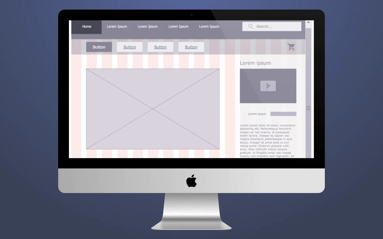
Wireframes designing
We create visible buttons, bars and other elements that may be located in a real website further, it fills a wireframe with a better understanding of how it will be designed and how it will look in future. In addition, wireframes of the website make it possible for us to see the information order on the homepage, what should be done first, what should be done second. This is where we think through user experience and try to understand user behavior psychology.
Step 4. Homepage navigation and layout building
A homepage should be done wisely since it is the first what your customers will see. So we pay a rapt attention to this issue during the web design workflow process since homepage tells your users what this website is about and what it offers them. So we should build homepage layout properly and make a navigation process easy and intuitive.
As for the layout of a homepage, it is necessary to distribute the information that will be positioned above and below the fold.
- Above the fold - all the information position in this part is visible to users first. As a rule, here we add the most important information for the user, so users don't need to look for it through the website. All interesting offers and bonuses also should be located at this point.
- Below the fold - here more detailed information about your brand or product you offer should contain. For example, the list of services you provide users with and detailed description of each service. To see this info, users need to scroll down the page.
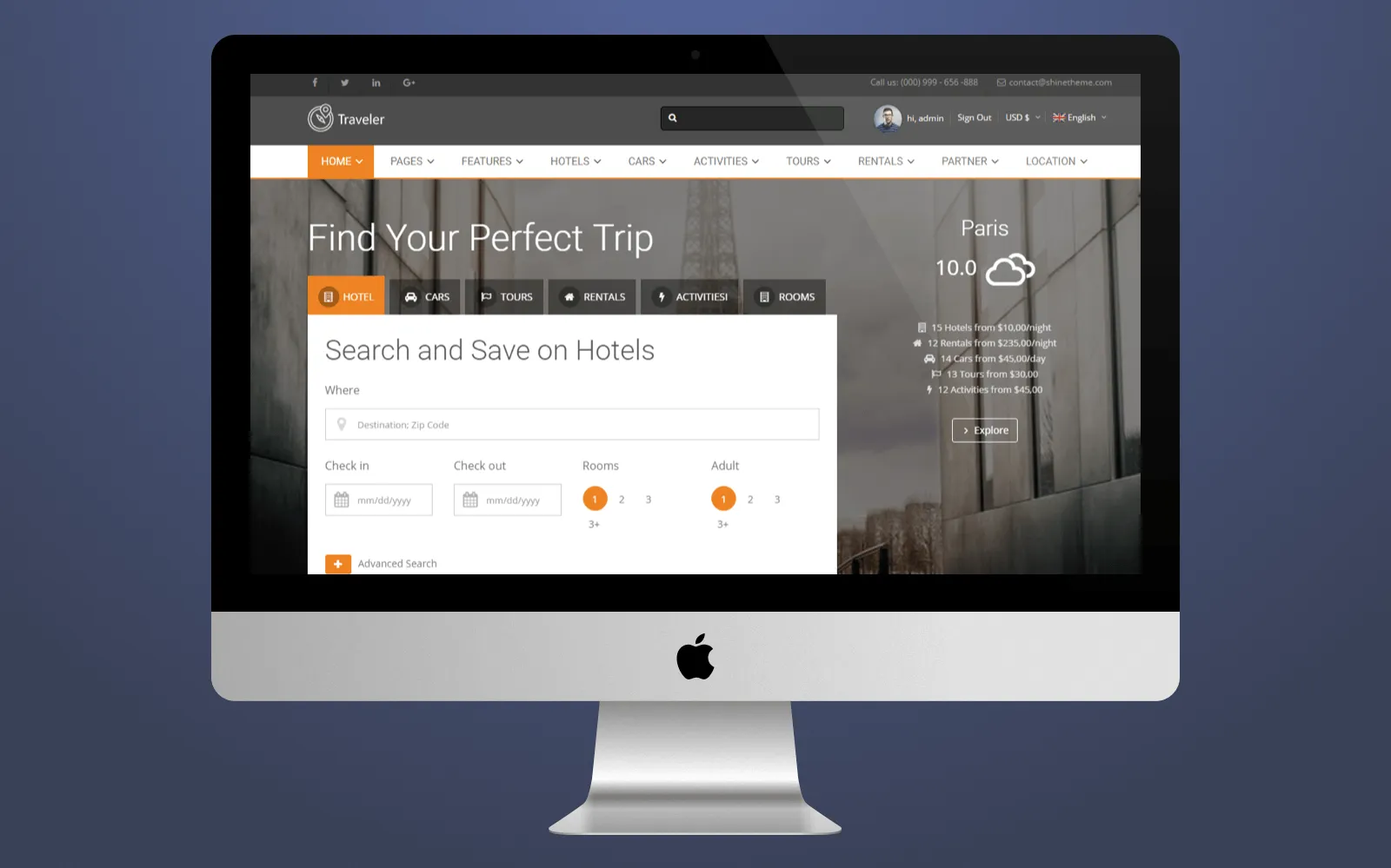
Homepage layout
In most cases, we put logo above the fold to let everybody see it first when they enter your website.
As for navigation, the majority of websites include menu bar on the top of the page that makes it possible for users to easily navigate through the website. Usually, menu bar contains main links to About company, Services, FAQ, Contacts, Testimonials and so on.
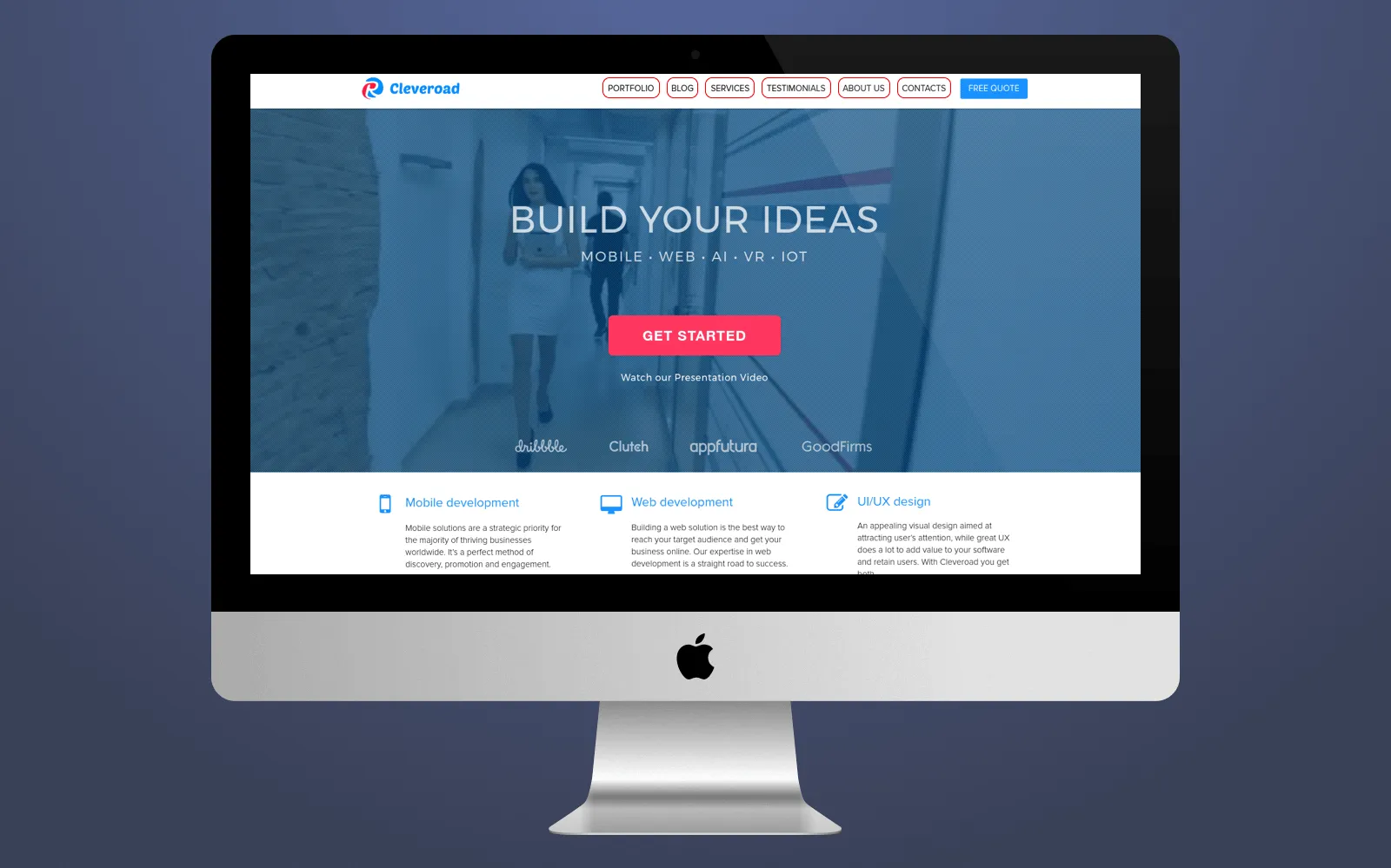
Navigation on Cleveroad's website
When we create website design and build the navigation, we consider the visibility of each element, create short titles since long ones usually irritate users. Also, all links should have a specific title. Users don't want to waste their time sorting out what you wanted to say. So, the navigation bar is usually located at the top of a website, and we always keep up with this principle as well.
Step 5. Additional website elements design
In addition to the common website design, we often add different small elements that enrich the website and make it a full-fledged.
Animations. To make a website more vivid, various animated objects can be added when we create web design, it has a good impact on user experience and increases more trust and loyalty towards the website from your potential customers.
What innovations UX can boast about in 2022? Read our article about the latest UX design trends
Loaders. When the user clicks on any page link on the website, and he or she waits until the page is loading, there can be a loader sign on the screen. Such signs you can see in mobile apps that you use, and they also decorate a website and make it more interesting and bright.
Banners. If we build a website for the marketplace or some e-commerce website, then banners are the one that such websites should contain. Usually, banners are rectangular images that contain promo video or image that has a relevant advertising.
Hints. Windows with useful hints that pop up when you navigate websites - it is very convenient, especially when you enter the website for the first time and you want to find something specific. Hints contain helpful information about the website.
Step 6. Color scheme and typography
Keep in mind that almost 90% of web users will confirm that properly selected colors for a website will have a direct impact on their decision to buy your product.
That is why a color scheme should be compiled wisely during the website design process flow. We usually think over what color the website background should contain, a color of buttons and other elements, their consistency. Also, we keep in mind that a certain color can have an impact on the decision of the user. For example, a website shouldn't be full of black or red colors - they are irritating and make people angry.
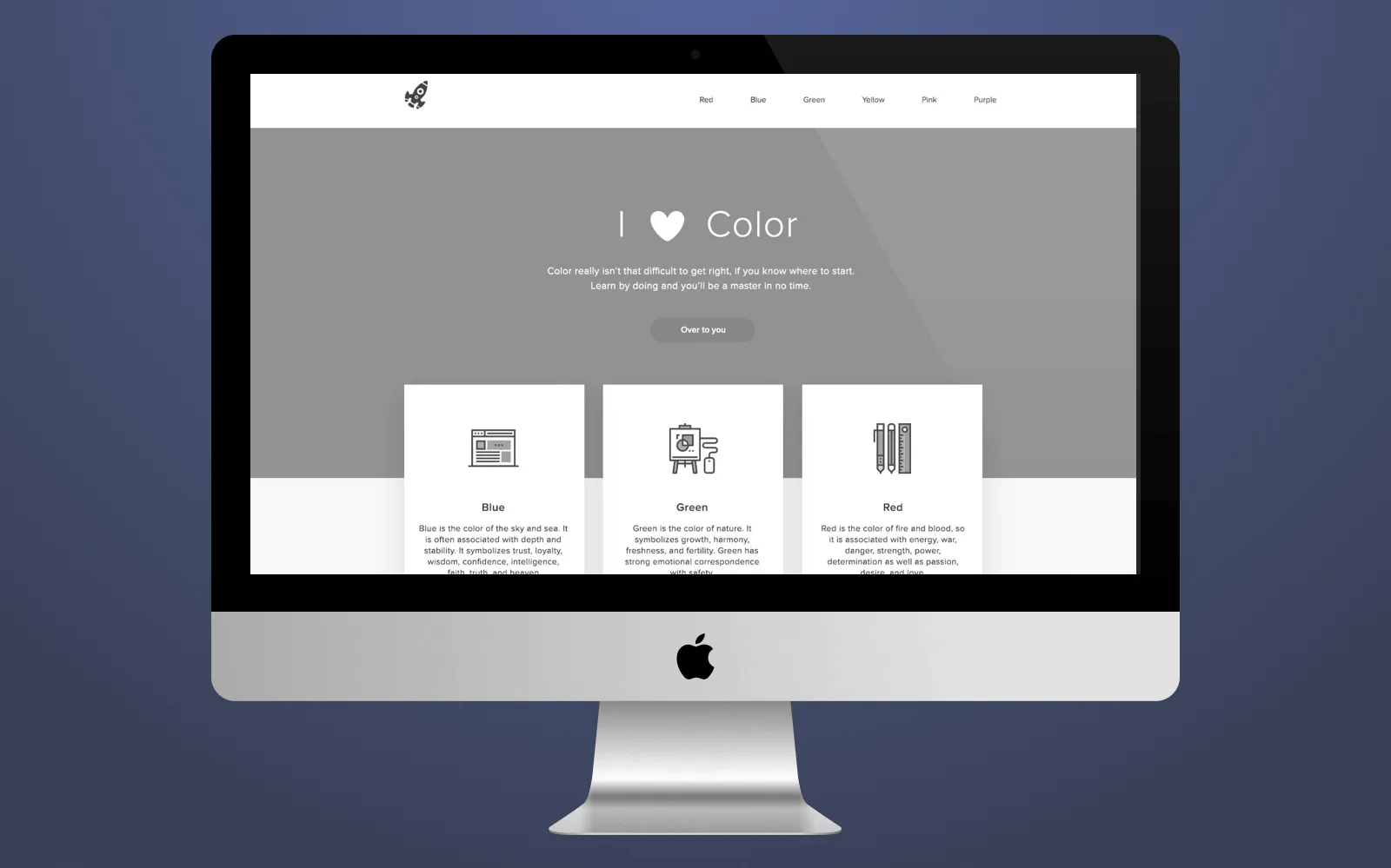
Example of color and typography on website
It is necessary to choose the color for each product separately since the total color scheme depends directly on the website subjects.
Typography should be consistent with the color scheme otherwise the website will turn into some kind of font and color cacophony. Also, the font should be readable and the font type shouldn't be extremely unusual. As a rule, Times New Roman is a conventional font we often use in websites. It is our main goal to know how to make web design wisely.
Step 7. Providing customer with prototypes
And, finally, we send customers prototypes of website design to let them evaluate the quality and general condition of a website. A customer can add some notes, ask for a revision if necessary, and we revise everything customer wants. After the approval, we hand over the website design to developers where front-end developers together with back-end developers work on the functionality of the website.
Types of website design we work with
Having listed all the steps we undertake to design a website, we can speak about different types of website design we can deal with from time to time.
Adaptive design
You can develop adaptive website that will fit perfectly any device, regardless of tablet, smartphone or laptop it is. Users of mobile devices don't need to expand certain areas of a website on their devices, they can easily click on the link they need. If the budget of the customer is high enough, adaptive design is welcome since it attracts more users and increases the loyalty towards the brand.
Figure out when responsive web design is crucial. Read Tips on creating efficient responsive design: when a responsive website prevails
Responsive design
Responsive design is similar to adaptive design, but it is not the same. It is a flexible web design that is changing when it is used on different devices. Unlike adaptive design, responsive web design doesn't change some elements, it simply stretches them. In most cases, a customer doesn't care about adaptiveness or responsiveness of the website design, our UI/UX designer makes a decision what is better depending on particularities of a website, so we make web design according to specific requirements.
Do you know the difference between responsive and adaptive design? Watch this video to find out:
Responsive vs Adaptive Design: Which's Best for You?
Bootstrap grid
This type is used for a quick building of website mockups and it simplifies the designing process, speeds it up as well. Bootstrap grid offers a set of tools for building websites and unique web applications. Our UI/UX designers use it often for creating website design quickly and efficiently.
Landing page
It is a single page website that serves a specific goal - call users to action. As a rule, such websites don't have too much advertising, a large number of buttons and so on. It has a limited number of purposes - leads generation, downloading of e-book or tutorials, subscribing, registration for a webinar and so on. Unlike common websites, a landing page is usually built quickly and it is created as an add-on to the main website.
Web design tools used by Cleveroad
In the end, we would like to show you a set of tools our UI/UX designers use to design your websites. Apart from necessary skills, our designers should have appropriate website design tools to help them apply all skills efficiently.
InVision
A cloud platform for creating mockups and prototypes of interfaces. With the help of InVision, our designers can share their work with a customer and with developers, and it is possible to monitor the whole process of UI and UX building. Agile methodology is the basis of this platform, InVision makes it possible to divide all tasks into iterations and versions.
Sketch
A tool for creating user interfaces on Mac OS. This is a very convenient tool that allows designers to make website design and draw dozens of app screens simultaneously. Moreover, it has a very well-thought interface, good interaction with styles, parameters of elements, there are intuitive shortcuts and so on. Also, UI/UX designers at Cleveroad use such Sketch plugins like Craft, Material, User Flows that significantly simplify and improve workflow, and UI/IX building process goes much faster.
Principle
A platform that helps us build animations and animated objects in the interface. Also, using Principle, it is possible to generate an interactive prototype. Unlike other tools, Principle allows us to create animations much faster and simpler. In addition, with Principle we can design multiple screens for animation.
After Effects
This tool from Adobe is designed for video editing, for editing of dynamic images, animations, designing different effects. Using After Effects, we create animations for mobile apps and websites. After Effects has a large set of different flexible tools.
Also, if we don't create UI and UX from scratch and we need to modify already existing web design, we can use the following tools:
- Photoshop
- Illustrator
- Figma
- XD
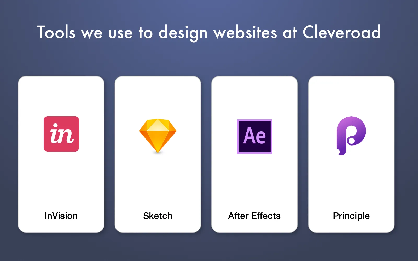
Designing tools we use at Cleveroad
That is the full list of tools our designers use to build a website design and mobile app design for you.
On the whole, with a clever approach, any weak design can be turned into a piece of art. That is why our specialists always learn something new and they strive to gain new skills and increase their level. If you have any questions, contact us at any time, our managers will be glad to help you. In addition, if you click a Subscribe button on the right side, you will get free e-books with useful information and you will not miss our new articles. Stay tuned!
You need to follow this seven steps to create web design:
- Step 1. Build a project plan.
- Step 2. Research & sketching.
- Step 3. Creating wireframes.
- Step 4. Homepage navigation and layout building.
- Step 5. Additional website elements design.
- Step 6. Color scheme and typography.
- Step 7. Providing customer with prototypes.
We can speak about different types of website design:
- Adaptive design
- Responsive design
- Bootstrap grid
- Landing page
The main goal of this approach is to place all the necessary content — buttons, texts, CTAs, features — on the limited space. And all these elements should be put in the right place to be accessible and viewable.
- Step 1. Build a project plan.
- Step 2. Research & sketching.
- Step 3. Creating wireframes.
- Step 4. Homepage navigation and layout building.
- Step 5. Additional website elements design.
- Step 6. Color scheme and typography.
- Step 7. Providing customer with prototypes.

Evgeniy Altynpara is a CTO and member of the Forbes Councils’ community of tech professionals. He is an expert in software development and technological entrepreneurship and has 10+years of experience in digital transformation consulting in Healthcare, FinTech, Supply Chain and Logistics
Give us your impressions about this article
Give us your impressions about this article
Comments
4 commentsThanks for this post. It is really good. Keep adding
Nice points for webdesigner
Nice Blog
Good blog