Wireframes: Why They’re So Important for Your Project
Updated 23 Jul 2023
7 Min
3170 Views
Wireframes are black and white layouts defining the size and arrangement of UI elements on a screen. They also shed light on functionality, converting areas, and navigation.
To keep the focus on the structure, wireframes have no colors, fonts, logos, or any other design elements.
Why Wireframes Are a Must for Any Project
Wireframes gather your ideas and functional requirements together and help you see the full picture.
Designers in your team work on the structure of screens, display the main elements, information, and preliminary composition during wireframing. They also think of possible ways for users to interact with your product (UX design).
It’s much easier to spot the project’s weak sides, pitfalls, and redundant functionality on this stage. You may want to add something new to improve the product or even change its logic entirely.
All these changes are easy to deal with during wireframing. Any change you propose on this stage has zero effect on the team’s workflow. It’s not that simple on the design stage though. Every change there will take more time and, respectively, money you pay for UI/UX design services.
Looking to know about the software development process? We’ve got an article for you describing every step: from planning and design to product release.
That’s the reason we insist on creating wireframes for our clients before moving any further. They’ll help you avoid a lot of shortcomings and get a top-notch product at the end.
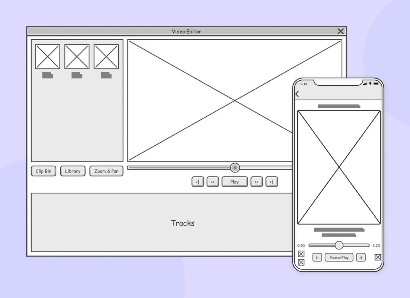
Example of wireframes
Drawing Parallels
Let me give an example to help you better understand what wireframes are and why they are so important. It’s about home construction.
Building a house, you first think of how to use the free space — where to carry out communications for electricity and water supply. Then, you decide how to place all these interior items you bought.
Once blueprints are ready, you get started with decorating rooms, choosing color palette, and doing other work. It works the same way in the world of digital design.
Why Wireframes Are Monochrome
Wireframes look like that in order not to overload screens with styles and let you focus on structure. Being focused on functionality, you can see missing parts and identify weak sides.
When there are images and colors on a wireframe, our brains start perceiving it as a design. In this case, your feedback on the wireframe may be spoiled as you’re distracted on visuals.
Types of Wireframes
There are three types of wireframes: low-fidelity, medium-fidelity, and high-fidelity.
Let’s take a closer look at each one.
1. Low-Fidelity Wireframes
Usually, low-fidelity wireframes are black and white sketches drawn on a piece of paper. Elements of user interface are represented as squares and lines without any detail.
Such wireframes are conceptual. Their main goal is to let developers understand the general concept. In turn, developers can make proposals for implementation.
2. Medium-Fidelity Wireframes
Designers use a monochrome palette or shades of gray to create medium-fidelity wireframes. Despite the fact that it’s still possible to draw them, the better way would be to use specialized tools (Sketch, Figma, InVision).
These tools are designed to create more detailed wireframes with realistic user interface elements. Medium-fidelity wireframes let the whole team see if any additional functionality is merging with the main features.
3. High-Fidelity Wireframes
High-fidelity wireframes are only created using design tools. The main difference between this and other types is that the wireframe looks like a ready-made product with pixel-perfect elements.
Such wireframes can be tested on compliance with requirements for people having different types of impaired perception of the color range.
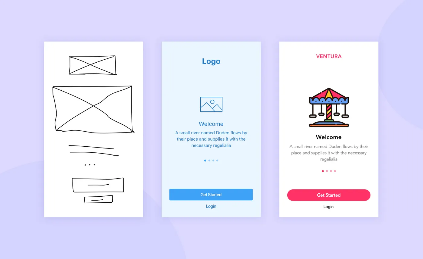
Low-fidelity, medium-fidelity, and high-fidelity wireframes (left to right)
Clickable Prototypes and User Testing
Wireframes can be easily transformed into clickable prototypes. The latter ones can be handed over to users for testing. It’s necessary to find out how convenient the design is, identify unobvious elements, and so on. This helps designers understand if user experience meets business objectives.
Find out the difference between wireframes, mockups, and prototypes.
In other words, clickable prototypes let designers check the layout’s usability up and down. Having testing results, they’ll see which elements are redundant and need to be removed, and which ones are unclear for users and need to be rethought. This way, you get a better product even before the development stage and save money.
Detecting behavioral patterns, tests are the only way to learn the real goals of the target audience. They define how the final product should look like to work well for end-users.

Clickable prototype example
Advantages of Wireframes
Let’s sum up everything mentioned before and single out the main benefits of wireframing:
- They allow estimating project development with more accuracy
- Developers understand what they’re going to work on
- The volume of data for the final design is getting clearer
- Further development goes without stops for making changes
How Designers Create Wireframes
It’s time to consider the methods and tools that can be used to create wireframes.
1. Pencil and Paper
No special software needed. Just good old-fashioned piece of paper and pencil. Your design team can use different colors to separate one element from the other. For example, icons can be highlighted red, titles can be green, and texts black.
Elements can represent dots, strokes, rectangles, and so on. The main goal is to make these elements as clear as possible.
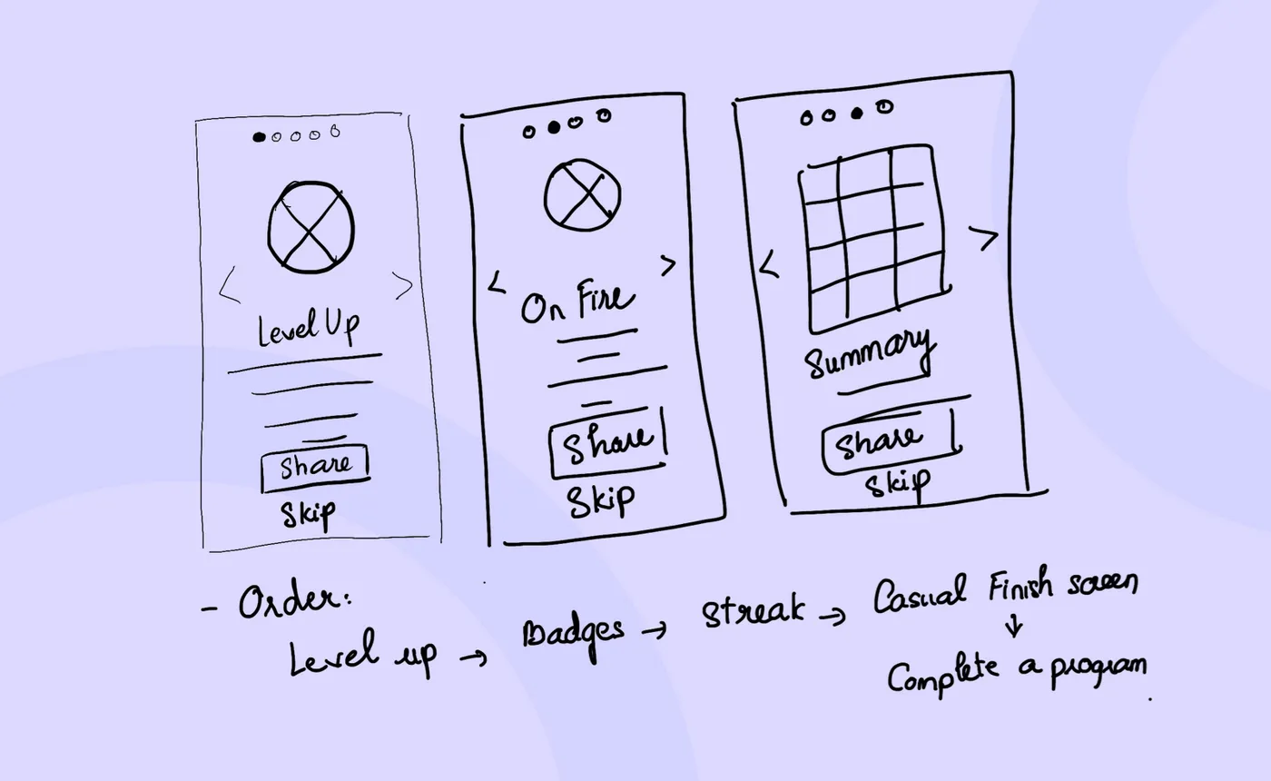
Wireframing with pen and paper
2. Paid Software With Free Trials
Here are some of them:
- Balsamiq
- Mockplus
- Moqups
- Wireframe.cc
- Mockflow
- Gliffy
Your design team can easily pick one of the platforms (iOS, Android, Web) using one of these tools. They let teams add premade elements and texts to wireframes, and share results with other team members including you.
When changes happen, every member of the team gets a notification about that event. It makes communication a bit easier.
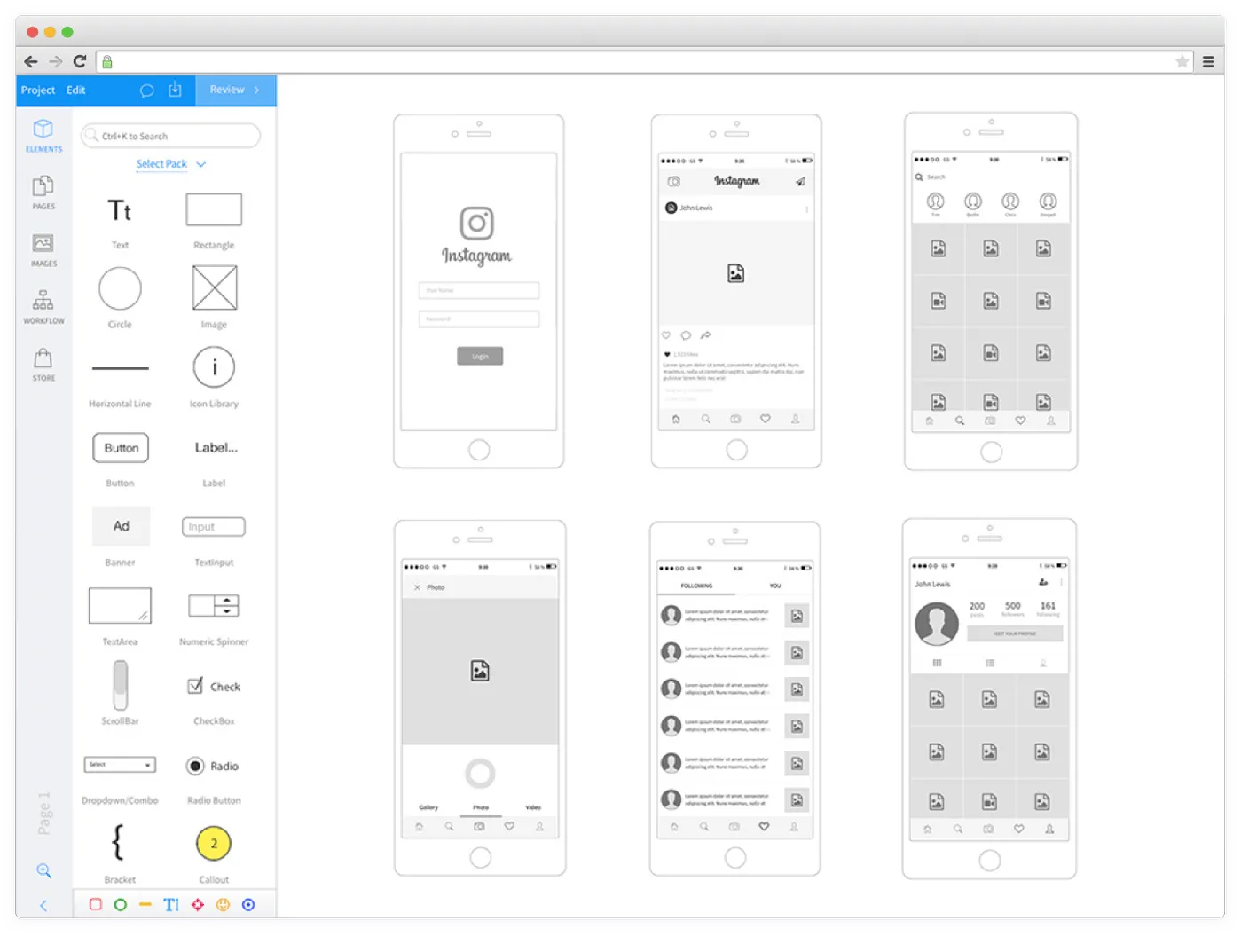
Wireframing with specialized tools
3. Digital Design Tools
They are such software as:
- Sketch
- Figma
- Adobe XD
- Photoshop
- Illustrator
These tools have lots of libraries with premade elements. The work on a structure for web and mobile apps goes easier and faster with their help.
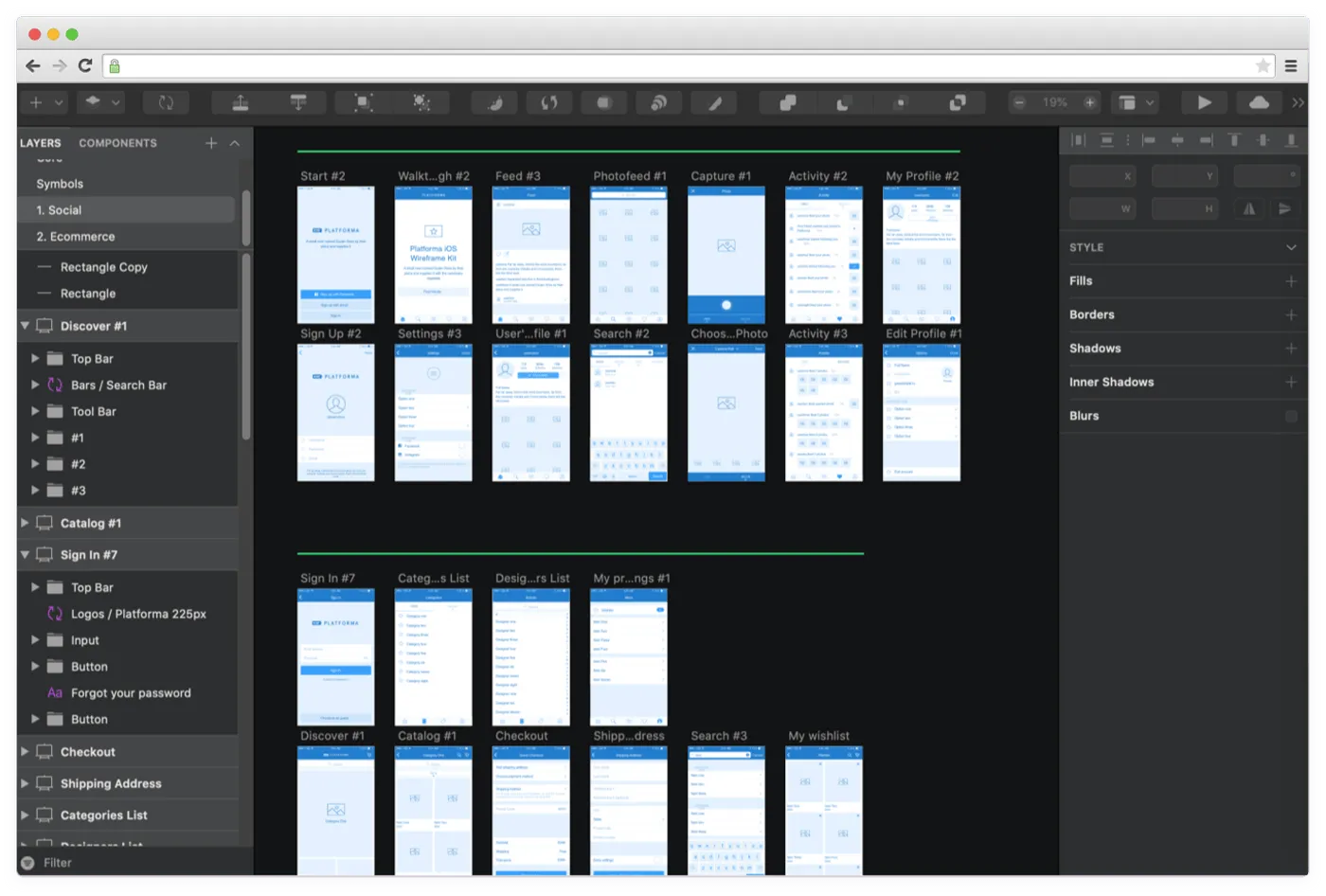
Wireframing with specialized software
4. InVision
We’ve decided to give InVison a separate section as it’s basically a multitool for product design. With its help, teams are able to create wireframes along with clickable prototypes and comment on every design element.
Every team member (be it a manager or developer) will be notified about every change and suggestion during the project.
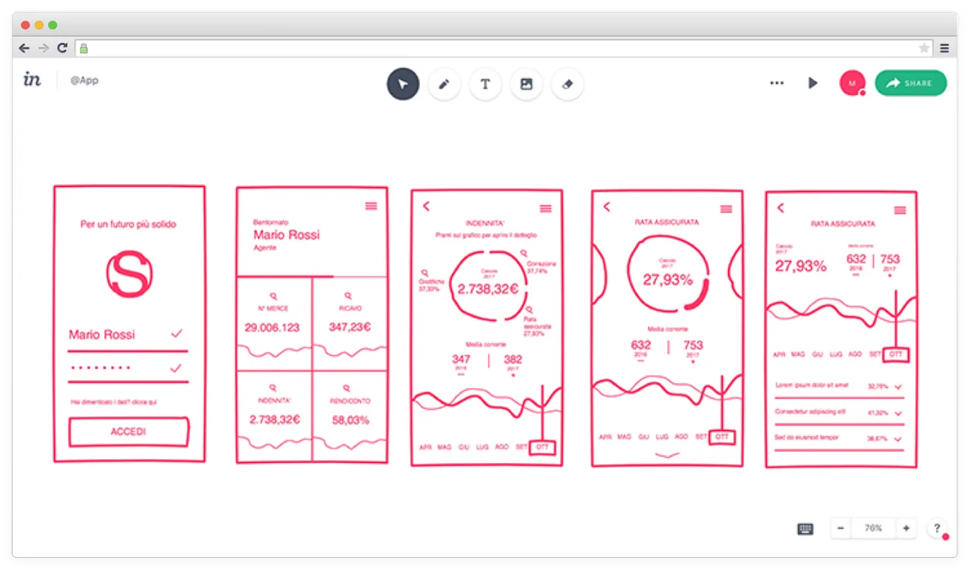
Wireframing with InVision
All in all, it’s possible to create wireframes in any program with tools like pencil, text, and geometric figures. They can be basic or detailed. Everything depends on your requirements.
At Cleveroad, we use Sketch to create wireframes and then upload them to InVision to make it easier for our clients to leave their comments and suggestions.
Wrapping Up
Wireframes help you focus on usability rather than visuals. Creating wireframes is a good way to illustrate screen layouts and functional elements on them.
Using wireframes on early development stages lets you objectively evaluate a product's usability, layouts, and functionality. Besides, you can find and eliminate shortcomings on this stage. All these lead to intuitive, functional, and splendid products.
Ready to design a product?
We’ll help you illustrate your idea and make sure it works well for end-users.
Wireframes are black and white layouts defining the size and arrangement of UI elements on a screen. They also shed light on functionality, converting areas, and navigation.
It’s much easier to spot the project’s weak sides, pitfalls, and redundant functionality on this stage. You may want to add something new to improve the product or even change its logic entirely.
- They allow estimating project development with more accuracy
- Developers understand what they’re going to work on
- The volume of data for the final design is getting clearer
- Further development goes without stops for making changes
Designers can create wireframes with the following techniques:
- Pencil and paper
- Paid software like Balsamiq and Mockplus
- Digital design tool like Sketch and Figma

Evgeniy Altynpara is a CTO and member of the Forbes Councils’ community of tech professionals. He is an expert in software development and technological entrepreneurship and has 10+years of experience in digital transformation consulting in Healthcare, FinTech, Supply Chain and Logistics
Give us your impressions about this article
Give us your impressions about this article